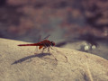
Draw a diagonal from the bottom left to upper right. Everything above the line is wonderful. Really nicely done. Below the line? The bokeh/blry on the bottom of the dragonfly wings is extremely distracting, as is the forced blur white wash. Top half gets and 8, bottom half gets a 4. Do the math.
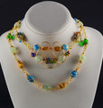
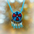
For me, there are too many pieces of jewelry included. I like the star-bursts in the text, but would prefer less on the jewelry. Since the title is "Dragonfly" the focus could have been on that piece.
Why is everything pushed off the the edges of the image with such a large empty space occupying much of the image? And what the heck is that red thing????







 Add photograph to your favorites
 Add photographer to your favorites


 Photographer found comment helpful.


