My first reaction to this was predictable stereotype. But looking at the photo a little longer reveals a very good photograph with a strong composition.
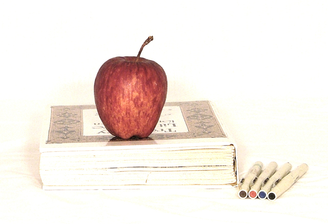
This is okay, and I like the faded effect. It seems the red apple should have been either more or less colourful. It doesn't look quite colourful enough to be the main focus of my attention, but not quite faded enough to blend in with the rest of the photo. The same applies to the tips of the four pens/markers...my vote would be to make the colours more vibrant.
Like the high-key in this. Wish the apple were a little more "polished" I think the colored ends of the pens fight for attention and draw the eye away too much. Nice idea, though.
A nice still life set up but I don't find that the extreme high key approach is the right mood for the theme. It looks like you knew what you were doing in terms of lighting so I won't suggest how you could tone it down but I think it needs it. The high key approach is nice for a slick, modern look but IMO warmer lighting is called for. If the apple had been resting on a lap top than this approach would have worked beautifully for me (although it still needs toning down a bit as the details in the apple and the colors just aren't popping like they should). Nice effort!






 Add photograph to your favorites
 Add photographer to your favorites


 Photographer found comment helpful.


