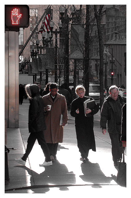
(1) COMPOSITION (CONTENT) I find the layout of this photograph to be very strong. You have succdessfully used the rule of thirds in seveal ways (i.e. the people in the foreground are placed along the bottom line of thirds, the no walk sign, while a little too far to the upper left, is also strategically placed.
I like your use of leading lines here, Everything seems to be pointing at these people.
(2) BACKGROUND The background is a little cluttered, but that seems appropriate for this subject. It is separated from the main subject by the halos around their hair and this seems to be quite effective.
(3) CAMERA WORK ,TECHNICAL Exposure is very well done. Your exposure keeps the whites very crisp and the blacks very black. I love the interesting highlights especially on the peoples hair. I realize this is a nit picking thing, but if you could have waited one more second for the person on the left to move from in front of that other person, your composition would have been tighter and more interesting.
There are so many facinating details that one really must look this photograph for a long time. My eye keeps getting drawn to the banners hanging on the far side of the street, as well as the American Flag above the main subject persons.
(4) DIGITAL PROCESSING ,TECHNICAL Your post processing is very good. Good choice of cropping vertically. There is really nothing I can add to this.
(5)MEETING THE CHALLENGE This photo does a very good job of meeting the challenge. This is a very typical big city scene and carries lots of interest and emotion. The first time I saw this during voting I was very confused by the title and I think maybe that was the case for many of the voters. I am glad to have read your explanation. Unfortunately it was not visible in time to help with your score.
(6) MY OPINION ON THE PHOTO This is a very interesting photograph. The composition is strong and it is well executed. Unfortunately, it does not seem to have any "WOW" factor. There is nothing to hold the eye of the viewer for more than the few seconds it takes to scan the photograph.
Don't understand what you are showing us. Decent photo, a little dark, but it really doesn't say anything about the sign. And your title doesn't help me understand either. The photo should say it on it's own, but then the title should help add to your meaning. The photo is worth a 5 but I don't see the challenge other than a hand sign just there. So 5 is all I can give it. Sorry.
Neat sun halos on the people walking towards you. Well done shot for the circumstances (shooting into the sun). I see your road sign, but I cannot see the connection to your title. I'm guessing, but is the title referring to the sidewalk glare? Is this a place name? Something in the man's cup? I'm also a bit conflicted about the challenge vs. your subjects (which seems to be the people). O.K. the sign is the "action" (or in this case the NOT action {don't walk}) and including the people is the who (shouldn't be walking), I guess this works. 6 Swash
The Don't Walk signal is almost too far in the corner -- might have been better to give some space around it so you could see more of the pole and it doesn't look like it was just stuck in there. Pretty easy to miss. Also, all of these people seem to be walking -- a shot of ppl standing might have made more sense. Just an idea.





 Add photograph to your favorites
 Add photographer to your favorites

 Photographer found comment helpful.


