COMPOSITION
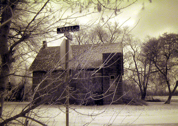
Normally, a centered composition like this feels static and uninteresting. However, I think your inclusion of the tree on the left, countered with a more open sitiuation on the right, helped to add some interest. I think the foreground branches give it a neat effect (discussed later) and help to add interest to an otherwise potentially simple "sign" picture. You have chosen your subject well, and have met the challenge in an interesting way.
TECHNIQUE
It seems to be slightly fuzzy/grainy, but in one respect that adds to the overall effect of the picture. The colors, too, are odd, but again add to the overall feeling the picture conveys. I do seem to see some noise in the sky, and think that the overall picture could have been more effective without it. Someone below mentioned despeckle, I would suggest NEATIMAGE.
OVERALL EFFECT
I think the strongest part of your picture is that it almost tells a story. It has a spooky/creepy quality about it that is enhanced by the grainy focus adn the wild colors. The foreground branches make it feel like the viewer is a spy, or uninvited/unwelcomed guest to the scene. Good work.
you've captured some lovely scenery here. perhaps just a few too many branches in front of your lens, would like to have seen more of the house. Stormy looking sky gives off a really nice touch.
Cool shot, love the old house and the tree background. Usually, I like foreground stuff, but this might be a little too much of it. The sepia tones are very effective.
8 Swash
The tonal qualitites you've achieved are beautiful. Great mood to this photo. I wish that the branch coming out of the bottom left wasn't there, but overall I like this very much.
I'm seeing a wierd artifact between the tree and the house - creating a purple effect. Did you change the colours before resizing the image perhaps? Also, the sign is difficult to see, although I understand why you tried to include the trees and the house so much - they really make the picture.
Don't really go for the color of the photo, seems yellowish. would love to have seen what the other street was - no hel and what "only kidding". But it is a nicely cropped and focused photo. I like the composition, just can't buy the color. But photo wise it's still a 6.
Wonderful sepia photo. Vignetting would normally annoy me, but I think it fits here. Makes me long fo colder climes (if my office weren't freezing, that is... brrrr).
I would have liked to see the sign to the left or right of the house. It may work better if you had taken the picture of the house at an angle and not centered it in the picture.





 Add photograph to your favorites
 Add photographer to your favorites

 Photographer found comment helpful.


