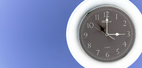
Oh! If only this were larger, so the viewer could see it better... This is a LOVELY image! The light is so smooth, clean and even. Absolutely beautiful image! Your composition and cropping was perfect, and the colors are vibrant and sweet. Definitely deserved a much higher score!
Oh, man! This is the most underrated image in the challenge!! 4.686?! That's an outrage. The beautiful subtle shading and smooth, brilliant colors are fantastic.
I can see only two (bogus, IMO) reasons mentioned in the comments this could deserve to finish less than 6.0 (I gave it a 9, I only very rarely give out 10s):
1) it's less than the maximum allowable size
2) the image doesn't SCREAM 'school' to some people apparently
I have to say that it's the best looking 17 KB image I've seen here. :) That said, you may have done a lot better with a image 640px wide, and use all the 150 KB you are allowed. I thought this was fine at this size, but obviously some people got hung up on this point.
I like the simple graphic quality of this image. I like the extreme right positionong of the clock. I just wish you submitted a bigger example. You should really take advantage of the 640 pixel max. It looks like there is some really nice subtle shading of blue in the background. It's just too hard to tell about the image quality when the photo is this small. That said, this is probably one of the best examples I've ever seen during my time at DPC that was submitted this small. This is probably due to the extreme simplicity of the image. Nice job.
Nice idea! I remember watching the second hand and listening for that last "buzz" it made as it clicked into the hour and rang the bell.
Composition has an abstract quality. On its own, the photo doesn't say "school" to me--maybe the subject looks too much like a kitchen clock. Interesting take and execution nonetheless.







 Add photograph to your favorites
 Add photographer to your favorites


 Photographer found comment helpful.


