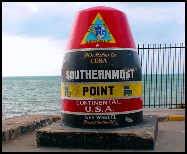
FIRST IMPRESSION: Very colorful shot. The fence is a little distracting though.
CHALLENGE: Some might argue that this isn't really a "road" sign, though I personally would give the benefit of the doubt.
COMPOSITION: Pretty good overall, but you might have benefitted from moving the sign to the right in the frame a little bit more.
TECHNICAL: Color and exposure are good. A narrower aperture may have helped here. It seems the fence is sharp but the focus on your actual subject is a bit soft.
CONCLUSION: A strong entry, but I think there was a bit more potential here. Overall, nicely done.
Thanks for sharing and good luck in future challenges!
Cool! I like the picture. I think the image would be a bit more effective if the pilar was not as centred in your image. That would get a bit more of the pleasing coloured water in the picture. jgillard6
Looks more like an ocean sign rather than a "road sign". Otherwise the photo is a really good one. I especially like the different colors in the water. Is this in the water on on the tip of the land. I'll have to give you the benefit of the doubt and assume it's on the land, in which case it meets the challenge. Anyway it's a really nich photo, technically and appeal wise. Nice one. 7
Pretty cool. Should have composed it so that the sign is all the way to the right of the frame (eliminating that ugly fence), and then waited for something interesting to sail by on the left, and snapped it. 7.





 Add photograph to your favorites
 Add photographer to your favorites


 Photographer found comment helpful.


