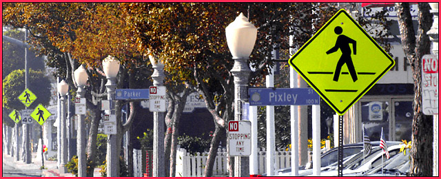
This seems like a great idea for a photo and you put it together pretty well. I like your decision to crop where you did, any more might distract from the main center(s) of interest. Nice colors. Some had accused you of creating a "cluttered" look, but I see it as the precise effect you were attempting, and, why would that necessarily be bad? I did agree with those who commented that the border was distracting and unattractive, it's not the border, but the color of the border that is so off. What about the ISO you chose(or did you)? Would it have been possible to use a slower ISO, or does the 500mm not allow that? Or maybe it was because you were "standing in traffic" and could not use a tripod and a slower shutter speed? I don't know, but it seems like a slower ISO might have made those most distant signs more distinct. They don't look bad, I'm just wondering if it would have been possible to make them look better. The "No Stopping" sign on the far right is cut in half, that is not very attractive. Very catchy title :)
back in the CANDID challenge, while i was snooping around at the train station, i snapped a 'walkin dude' several blocks away with my 500mm - he came out nicely framed within a forest of signs and bushs, and i liked that look
this is that same stretch of street, taken from a diffrent angle - this time i stepped out into traffic to get the best view of the signs - using the 500mm stepped down, the DOF was also good enough to keep both extremes in focus - i believe that we're looking at almost 4 blocks here
real real nice, wondering what you cropped out of the foreground. the line of the street moving from center side left to lower right corner might've been nice. great lighting, right focus to be able to read all the signs. i'm an anti-border bigot though, can't be bothered with them.
You've even got some American flags in there. Great photo. Lots of signs, love those lamp posts and Street signs, nice greens, browns, white poles, nice job!
Great content for this challenge. If you could stop down the lense to f/8 or so and focused on the "Parker" sign you might have been able to get enough depth-of-focus to get all the signs in sharp focus.
Funny/odd shot. Your title's a bit long, but it's understandable. Good focus and color. Framing: I think I could have lived w/o the last partial No Stopping sign. Wicked waste of tax dollars. Are the ppl THAT dumb there? 8 Swash
The urban crush is well exemplified by this image. I like the splash of russet foliage to soften the harsh city look. The panorama format suits the foto perfectly although I am not a big fan of the red border. This format seems to balance the plethora of vertical elements present. The pedestrian signs pop out well from the relatively high key background. Order among chaos. A well executed concept.
Your title sounds like a blond driver at a flashing red light. Think they have enough signs and poles? I've never seen a street like this. Nice sharp focus, good lighting, good composition. Photo looks crowded because street is crowded. Too much. But the photo is worth a 7 and sure does meet the challenge of "street signs".
I really like this shot and I think the title is great too. It is a little cluttered, but it doesn't have extra "stuff" in it either. Great focus. I might have picked a diferent boarder though. The pink is kinda an odd colour choice.
I love the variety and number of signs you were able to capture here I also like how the yellow signs jump out of the picture. As a side note, and not effecting the picture score in any way, I think the red border is a bit much. Maybe a more subdued color would be better, but that is just me.
Nice photo showing the overuse of signs - I considered a very similar shot myself. I'm not sure about the half-cropped sign on the right edge though - perhaps you should have left it entirely in or cropped it out fully. I think having the walk sign in the top right corner could have worked well. Goot work though.
I don't like to see a thin border on an image that's already too busy. But that's just me...the photo is, well, busy, but i do like the play on the signs...good luck :)
I really love the depth of the picture, all those street signs in such a small area, it's unreal. I love how my attention goes from one side of the shot focusing on the first school sign and is dragged across the whole shot all the way to the left. It looks to be a bit hazy and some of the signs further away are hard to read, but you know what they are. I am very impressed with this shot.9.
the red border is not a good idea, you could have maybe gotten away with the bright yellow color of the signs as a border, but it's good to stick with black or white unless the scene really calls for something else.





 Add photograph to your favorites
 Add photographer to your favorites

 Photographer found comment helpful.


