Composition (content) This is a composition that makes you think and that is the strongest point of it. It is indeed obvious, but you need to look at it, it is not a click 'n go image. :)
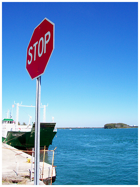
I guess it is the ramp to the ferry.
Very good colors. Nice red, beautiful blue sky tones and a bluegreen sea.
I think that this is taken around 12.00, when the sun is at the highest point in the sky. The angle of the shadow is very steep and the exposure information hints a very bright situation.
Shooting this scene at that time of the day has probably caused the too bright concrete and blown out whites of the ship. No exposure compensation can prevent this, only shooting earlier in the moring or later in the afternoon. The result would be more shadow and warmer light that gives better contrasts. Around noon on a sunny day at the equator is the worst time for photography, but it is also the time when most people have their lunch break.
I think the ship as it is now, with those bright whites, is a bit distracting.
The angle at which you shot this and the position of the horizon is very nice.
Background Blue. :)
Camera Work (Technical) Sharpness, focus and exposure (given the time of day) are good. The soft water is caused by the relatively slow shutter, but that is just a note, not a problem.
Digital Processing (technical) Sharpening is on the edge but good.
My opinion Funny, but not special, I think that I would have liked to see more of the left and in better lighting.
Beautiful "or else" photo. Nice composition with execellent execution. Love the color of the water. Just a great photo, technically well done, and meets the challenge clearly. Worth an 8 to me.
If there realy isn't any more road, then it might have been better to show the dock-side. If you have cropped this to make it appear this way, then disreguard what I have written.
Toooooo funny! Humor in photos works well for me. Colors are crisp and good focus. I'm not sure about the boat though. Maybe with a more "frontal" view of only the water and sky??? Good job! 8
Yeah hmmm lets drive into the water. Good find for a sign :) I like the placement and angle of the stop sign, just wish the boat was not so close in the background, it really takes your attention away from the sign. The colors are bright and vivid and the focus is very good on the sign. To my eyes there seems to be a bit too much dead space, but the overall effect works for the shot.7.
Slightly overexposed(note the white on the ship) and seems slightly blurry. I can't tell if it is motion, focus or just camera limitations, but the colors are nice ... especially the blues.
Well done - the framing is quite good although I wonder if a slightly longer shot (perhaps including the base of the sign post) would work well. Colours are lovely and the clarity of the stop sign is very good.
:) Have people run this stop sign? Nice image... it would be nice if you could see more of the drop off, that might give the photo a little more impact. 7





 Add photograph to your favorites
 Add photographer to your favorites

 Photographer found comment helpful.


