B.O.T.P.A.C.
Bottom of the Pack Analytical Comments
Every challenge I am going to leave comments on some of the photos that finished at the bottom of the pack. I will try and explain why I think the photo did not do well in the challenge, which will hopefully result in increased rankings in your future photos.
-Ben
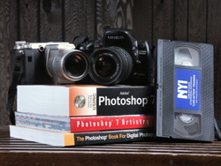
1) Lighting. The lighting seems just normal, as if you've placed the items on a table and taken the photo. A lot of people like lighting in still life photos to add something to the photo.
2) Size. The photo is too small to evaluate properly. Most voters like to see the full 640 pixel limit to be used.
3) Interest. There is not much in the photo to bring attention to it. People like something interesting to look at and/or think about.
The pic seems pretty nice but it's much too small to evaulate properly. Try submitting an image scaled to 640x480, or at least make sure the largest side is between 600 and 640 pixels.
I'm sorry but I didn't find this very interesting. The dark background didn't help but it may have been better with an open page and some text perhaps? 3
I'm sure you've heard this a few times already but it can't be emphasized strongly enough---this is far too small to evaluate. Please take advantage of the 640 pixel max. It makes all the difference.I believe there are tutorials on how to compress your file size without sacrificing pixel size and quality.
From what I can see, you've got a decent eye for a still-life set-up and the lighting looks pretty good (perhaps a bit overexposed from what I can judge by the extreme white of the books' pages--I should see some shadow area).





 Add photograph to your favorites
 Add photographer to your favorites


