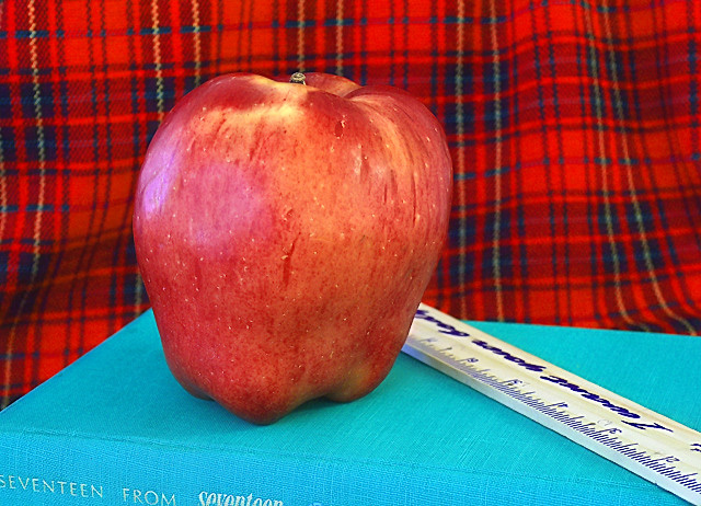
To me, this isn't very interesting to look at...what is this photo saying? What was the reason for taking it? What's with that background? These are all things that need to be addressed.
I like the colors. I would suggest that it might have been better to crop it so that the title of the book doesn't show. It's not a particularly significant title and the white lettering at the bottom is a bit distracting. The lighting is a tad flat -- although the exposure looks good I'd like to see a bit more rounding of form on the apple with a slightly darker shadow area falling on the book for a bit of depth.






 Add photograph to your favorites
 Add photographer to your favorites


 Photographer found comment helpful.


