Justine,
Thanks for the critique. I found it to be helpful. I agree with the part about the head. It and the dark jacket blend in with the background. A cap would've been good.
CC:
Hello Jitams!
______________
Fits The Challenge-Yes.
Composition-Nicely arranged.
Background-Good.
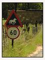
Digital Processing-_Dark_. It's difficult to distinguish between the head, the camera and the background. Levels adjustment would of helped some, hair bleach or a light colored baseball cap. I saved this shot and lightened it just a bit...hey I can see you hair now. :) Technically this is a very solid shot.
My Opinion-Hope I'm not sounding overly critical.
I haven't even told you that I liked the idea and thought it was very clever and I voted a 7. My grandson's [ages 12&13] thought this was a riot and got a big hoot out of it. Three cheers for your good eye, and creative mind. Thanks for allowing me to review your 'Head Games'.
Love it. Right on. Would have liked a little differentiaion between the background ant eh head since the sign with the head is your subject. But still a good shot.
It looks like some tag team photography going on here - congrats. That also looks like a good camera in his hands. I love the humour of the sign in this shot - very dry. Composition is pretty good however the top edge is a little uncomfortable - difficult to crop with the top of the sign crooked. I wonder if rotating the image to crop along the sign edge would have worked or looked silly.
i don't understand what you are trying to portray. the sign is okay, although it's not to interesting to me. the focus is spotty at best and is almost distracting







 Add photograph to your favorites
 Add photographer to your favorites


 Photographer found comment helpful.


