Lili, thought at first this photo was playing with the flying plane in the upper left section, then I read the title and got your point!
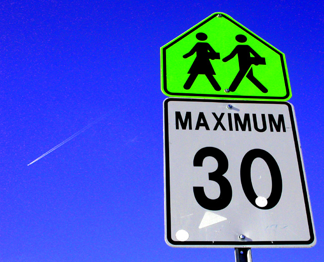
Composition: Good use of negative space, a nice simple clean composition, with contrasting colors. I, like some of the other commenters like the plane in the sky and it helps make fun of the speed sign and balances out the picture a bit.
Technical Quality: Some jpg artifacts in the solid areas might have been removed with despeckling,
salt/pepper filter or an edge preserving smoothing filter such as neatimage. Wish those sticker looking white things weren't on the sign, but hey, it's a children's crossing and they tend to put stickers on anything they can find, if that's what they are. They are a bit distracting to me. I like the interesting angle of the shot. Except for the artifacts, the shot is crisp, well-saturated and well-lit.
Overall: An interesting photograph, likely not something I would hang on my wall, but the challenge this week was difficult to meet with "pretty" photos!!
HOpe this has been helpful to you. (;*)
Creativity: Nice use of an otherwise boring sign, especially with your interpretation, the plane included and the humourous title.
Lili, thought at first this photo was playing with the flying plane in the upper left section, then I read the title and got your point!
Composition: Good use of negative space, a nice simple clean composition, with contrasting colors. I, like some of the other commenters like the plane in the sky and it helps make fun of the speed sign and balances out the picture a bit.
Technical Quality: Some jpg artifacts in the solid areas might have been removed with despeckling, salt/pepper filter or an edge preserving smoothing filter such as neatimage. Wish those sticker looking white things weren't on the sign, but hey, it's a children's crossing and they tend to put stickers on anything they can find, if that's what they are. They are a bit distracting to me. I like the interesting angle of the shot. Except for the artifacts, the shot is crisp, well-saturated and well-lit.
Overall: An interesting photograph, likely not something I would hang on my wall, but the challenge this week was difficult to meet with "pretty" photos!!
HOpe this has been helpful to you. (;*)
Creativity: Nice use of an otherwise boring sign, especially with your interpretation, the plane included and the humourous title.
If the contrail was at any other angle it would be a distraction, but it works as you got it. Interesting that the top sign is the same shape as a baseball home-plate.
I love the contrast and simplicity of the colors in this shot. My only suggestion would be to try NEAT IMAGE or somethng like that as I can see some "noise" in the sky (other than teh plane and contrail).
is it over exposed or is that the real color of the yellow sign. The sky in the background is great. The airplane is a added bonus, however I don't think he is going 30
Nice vivid colours. A shame about the plane, I would have prefered a clear sky. I would also have zoomed out a touch, so that the signs were not so close to the edge of the frame. Otherwise, great shot. I like it.
Excellent composition! My second best photo of the challlenge! I really love the jet in the back ground and your title makes me laugh! Hihihihihihihi! :OP
The perspective is great, colours are wonderful and the jet stream is an interesting addition. My question, then, is what are the three white patches on the 30 sign? Are they some kind of reflection or something stuck to the sign? I must say again though - the blue and green is wonderful.





 Add photograph to your favorites
 Add photographer to your favorites


 Photographer found comment helpful.


