Greetings from the Critique Club!
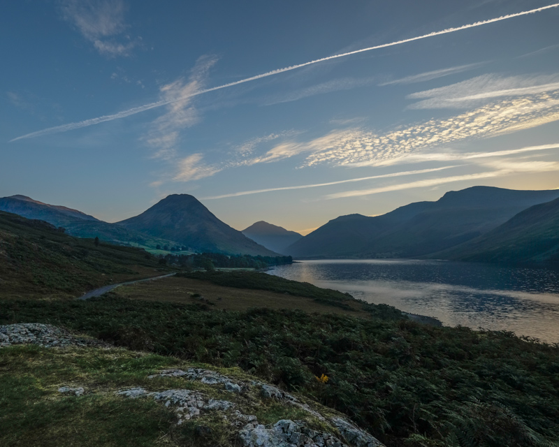
I like the low lighting and leading lines of comp here, though I think it's also a little on the safe side - the horizon looks a little too centered. Though I see the triangles and geometry, like the obvious ones in the mountains, but also the road/field junction, this image simply isn't as literal as voters like.
The contrails, especially the topmost one in the sky, detract from the triangular shape of the mountains, and of course white will always draw the eye like a magnet.
Hope this critique has been of help, feel free to PM me.
Susan |








 Add photograph to your favorites
 Add photographer to your favorites

 Photographer found comment helpful.


