Well well, I get to critique one of your photos. Ok, where to start? : )
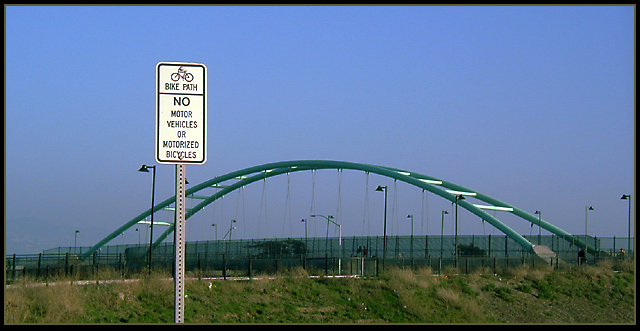
One of the first things that jumped out at me was how well you presented this photo. The cropping is very appropriate, the subtle border presents the image very well, and it is very clean and natural looking. As far as the photo content goes I find it fairly ordinary and without much punch. I feel it needs more visual appeal like dramatic lighting or a very unique perspective. Something that grabs the viewers attention. I would like to see what it looks like from a lower perspective so that it looks like the sign towers authoritatively over the bridge and didn't compete visually with the other vertical street lamps or in size and weight to the bridge. As it is now both the sign and bridge seem to compete for the primary focus point. As I said it very good technically and in it's presentation but it is lacking in visual appeal. I think this would have been a great opportunity for some greater visual risk taking.
I see your "road sign" but not the path. The metal arc appears to be the subject of the photo and I can not tell what it is. It almost appears to be chains hanging down from the metal frame, but there are no seats in site. It's a nice photo I just can't figure it out too well. Hope you explain it to us.
Good placement of the sign and also good focus. The lighting is good, looks to be a hazy day, I can kinda make out some hills or something to the left. Not a super interesting shot, but well taken.7.
Technically the photo is fairly good - composition, colour, focus, etc. Unfortunately it's not a very exciting photo. Perhaps you could have got a photo of some cyclists on the path or something?






 Add photograph to your favorites
 Add photographer to your favorites

 Photographer found comment helpful.


