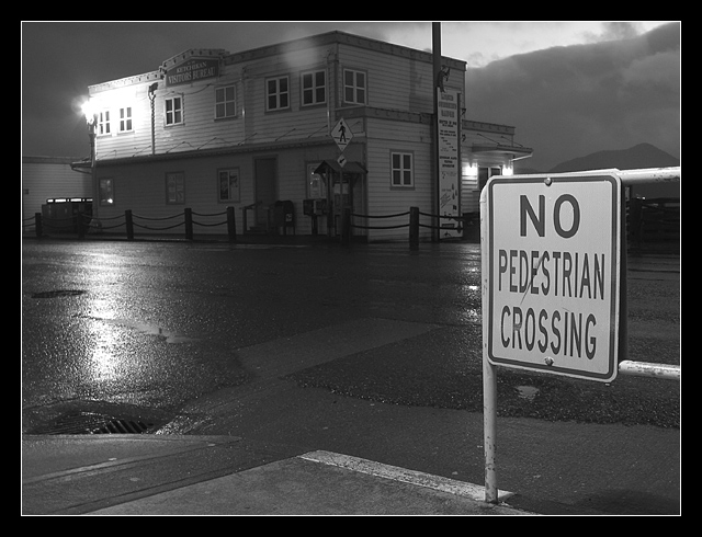
I wish we could use spot editing so I could get rid of that lens flare. I was able to dodge and burn it so you couldnt even tell it was ever there, but since I'm not a cheater, here is the image, lens flare and all :)
Statistics
Place: 11 out of 174 Avg (all users): 6.4683 Avg (commenters): 7.2143 Avg (participants): 6.5085 Avg (non-participants): 6.4138 Views since voting: 1455 Votes: 205 Comments: 29 Favorites: 1 (view)
I particularly like black and white photos. This one is nicely exposed as well. The tonal range is excellent and the positioning of your road sign also works very well in this shot.
As for your comment on lens flare, I don't think that is much of a problem at all in this photo. I don't believe anyone even commented on it :)
I don't think I can really suggest any real improvement on this shot. I like the mood it presents to the viewer... This looks like a storm near dusk possibly. I don't think it's really moonlight. The moon would not be visible during a storm :)
I think you've captured a great Black & White Photograph. It's so stark, so captivating! The lighting on that building across the street is great, and the moonlight breaking through the dark clouds. . . You've even been able to capture the "pedestrian" crosswalk" sign on the other side of the street. The small puddle at the bottom of the sign, - - it's a great photo.
This is a really moody shot. The eyes seem to be drawn towards the single bright light on the far corner of the building. The only problem is the spot near the top centre of the frame, is it rain on the lens?
Very nice tones, and a good, desolate feeling. Plenty of depth for that walk-into-the-picture feeling (especially tasty irony w/r/t the sign). The top feels a little too tight to me, and the white border aggravates the problem.
Nice work - I like the feel to this photo. You were lucky to get a wet road to photograph. The sign grabs my attention since it is well lit in the photo. The border is appropriate and frames the photo well without distracting me. Great work.
Pleasantly surprised at the quality of this night shot. Very clear and sharp. Love the sky. The sign on the other side of the street says it is a pedestrian crossing. Wonder which sign is correct? Would love to see a daytime photo of this place. Well done and really deserves a 9.
The lighting is very pleasing in this image. I especially admire the wet look on the pavement and the various textures. The highlight on the pavement is beautiful. Personally I would like to separate the sign from the lights and building corner in the background. A matter of breathing space.The hint of bright sky adds an uplifting note to a sombre picture. The sign does stand out well from the background which is another nice contrast. A worthy notable image.
nothing less than a ten. by far the best photo that I have seen. the sign is a small portion of the whole package which is perfect. Did I mention that this is a 10 and the best photo that I have seen so far
There is just something visually pleasing about this shot. I like the placement of the No Ped sign and the fact you can see the pedestrian crossing sign across the intersection. The black and White in the photo really makes the main No ped sign stand out. This just proves you can take an everyday sign and make it art. Great Job! 10 The only thing that troubles me about this shot is the bright light on tyhe building, The no ped sign is so bright compared to the dark background, but the light is even brighter, and draws my attention. The dilema though is if you cropped it out, then you would not have a full building, I like the choice you made, but the light is still a bit distracting.
Looks like nothing special initiallyl, yet strangly I find it very pleasing. I like how you can see the texture of the road. Everything is in nice sharp focus as well. 9





 Add photograph to your favorites
 Add photographer to your favorites


