| Author | Thread |
|
|
10/29/2004 09:32:40 AM |
B.O.T.P.A.C.
Bottom of the Pack Analytical Comments
Every challenge I am going to leave comments on some of the photos that finished at the bottom of the pack. I will try and explain why I think the photo did not do well in the challenge, which will hopefully result in increased rankings in your future photos.
-Ben
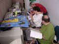
1) This photo does not immediately fit the challenge without an explaination. The photo should speak for itself and not rely on an explaination. It may fit the challenge if people think about it for long enough, but with 200 photos to vote on, most people will only look at your photo for a few seconds before deciding it doesnt meet the challenge and moving on.
2) Composition. It is very cluttered. Most voters prefer simply composed photos which draw attention to the focal point. This photo doesn't seem to have a focal point.
3) Post Processing. The photo has a n orange tint to it which isn't natural. A lot of voters like the photos to look as natural, and be as technically perfect, as possible. It looks like you used the wrong white balance, which is why a lot of people would have voted you down.
4) Size. You haven't used the full 640 pixels, so voters can't see as much detail in the photo as they would like. |
|
 Photographer found comment helpful. Photographer found comment helpful. |
Comments Made During the Challenge  |
|
|
10/26/2004 12:49:25 PM |
|
the lighting is very warm, and It's a little confusing, at first, on which piece of furniture is the subject. |
|
| Photographer found comment helpful. |
|
|
10/23/2004 02:36:33 PM |
|
I llike the warmth you've caught with this photo, but the whole thing is a bit busy for me. |
|
| Photographer found comment helpful. |
|
|
10/23/2004 02:26:49 AM |
|
an escritoire? Not really schoolroom furniture... |
|
| Photographer found comment helpful. |
|
|
10/22/2004 04:17:59 AM |
|
You found an interesting thing to show us... but picture looks just like fact that it exist. You could work on more creative angle and show some interesting detail even if there wasnt enough space to show all of it. |
|
| Photographer found comment helpful. |
|
|
10/21/2004 09:14:31 PM |
|
Seems to have a color cast. "Golden" rule days effect maybe? |
|
| Photographer found comment helpful. |
|
|
10/20/2004 01:11:21 PM |
|
a it small. try to resize it to600 pixels on the long side next time |
|
| Photographer found comment helpful. |
|
|
10/20/2004 12:53:57 AM |
|
seems like a snapshot to me not very well comp. also it seems to yellow just not very inturesting to me sorry. |
|
| Photographer found comment helpful. |
Theme:
Classic /
Light /
Dark
Home -
Challenges -
Community -
League -
Photos -
Cameras -
Lenses -
Learn -
Help -
Terms of Use -
Privacy -
Top ^
DPChallenge, and website content and design, Copyright © 2001-2026 Challenging Technologies, LLC.
All digital photo copyrights belong to the photographers and may not be used without permission.
Current Server Time: 10/12/2026 02:02:11 PM EDT.






 Add photograph to your favorites
 Add photographer to your favorites


