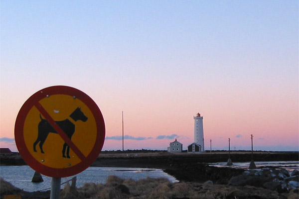
(1) COMPOSITION (CONTENT) I find the layout of this photograph to be one of its great strengths. Both the horizon and the lighthouse are strategically placed to draw the viewers eye into the photograph.
I like your use of leading lines here, the way road and the line of clouds both draw the eye to the lighthouse is very powerful. Unfortunately, this makes the lighthouse the subject of your photograph rather than the sign.
(2) BACKGROUND The background of this photograph is the sky and the lighthouse. They are presented in such a way that they have overwhelmed the subject. This is almosst forgiveable because of the beauty, but I do believe the voters will not be able to over look this and you are likely to suffer for that in your score.
(3) CAMERA WORK ,TECHNICAL Exposure might have been more appropiate for a landscape rather than a "signs" challenge photo. I think the sign needs to be more the center of interest. Perhaps if it has a little more light suih as some fill flash. You might have also tried reflecting some of the beautiful sunset light onto it with a large reflector.
(4) DIGITAL PROCESSING ,TECHNICAL Your post processing is very good. You might have added to the strength of the composition by cropping it a little tighter and losing a little of the upper part of the sky.
(5)MEETING THE CHALLENGE This photo does a fair good job of meeting the challenge. When you have a background as beautiful as this one, its rather difficult to focus on the sign.
(6) MY OPINION ON THE PHOTO The scene here is beautiful. I think perhaps this is a photo that you might try to reshoot in many different lights and times of day and in different seasons. This is a great location to get some really neat shots. Well done!
This is beautiful. Am I the only ten? I like to go back to my tens (I only give three or four) and see where they place. I hate it when they end up way down here.
Good sense of humour. As a suggestion perhaps a bit more sea in your shot to emphasize the sea dog quality. The lagre area of sky tones are nice and tend to draw the attention to the background instead of the sign and sea. I guess you need a 20 ft ladder to work the vantage point here. Not a bad shot
No dogs with detachable heads allowed huh? The sign is perhaps a little too dark (although you'd probably have to artificially light it to overcome that). Composition is pretty good - maybe too much sky but in a way I like the balance... it creates a sense of openness and space.
What a beautiful pic, too bad that sign is in there hehe.:) I hope you took some of these for yourself without the sign though because this really is a beautiful scene.






 Add photograph to your favorites
 Add photographer to your favorites

 Photographer found comment helpful.


