|
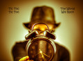
Nice photo treatment. Not so much with the slogan and text - at least for me. I'm not talking about the message, I'm talking about the actual verbiage and text spacing. Lots of empty space and skewed text. I would have included the title on the poster. |







 Add photograph to your favorites
 Add photographer to your favorites

 Photographer found comment helpful.


