Composition
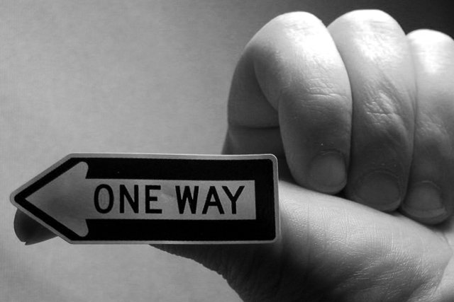
A clever, and original idea! You could perhaps have aligned the sign so that it hid the Tip of your thumb. The black and white format was a very good choice for this image, it would not been as effective for me in colour.
Exposure and Lighting
The lighting is not quite right it is too bright on the top of your hand and too dark on the sign. This is giving a somewhat soft look to the image it needs a bit more contrast.
Suggestions for improvement
Different lighting
Perhaps having the back of the hand showing rather than the fingers!
Hard too improve a very good shot!
This one gets it for humor. They just said "road sign" and sure didn't say where they had to be did they. Looks like it's beginning to peel away from your thumb on the back end of it. Just a little dark, but not enough to really hurt the photo that much. Shadows are a bit distracting, under the thumb and on the side of the first finger Nice B & W. Nice composition with decent execution. Congrats on a 7.
A cute pic! Good sense of humour and a nice creative touch. B&W works well for this shot. I like the close cropping, too. The knuckles are a tad bright compared to the other flesh tones for my taste. A good foto.
I think the sign needed more light - my eyes are drawn to the fingers initially. I like the composition and black and white was the correct choice I think.
Cute shot! Very good details on the palm/thumb, but the knuckles are just to glaring to miss. (Maybe try a little powder?) Still overall, it's very good. 8 Swash
This is a phenomenal shot and it's also my favorite of the week for the 'signs' challenge. It's definitely the most creative shot I have seen this week, and coupled with your choice of black and white, I hope you have a winner here. I would love to see this on the main page all week next week... kudos on my 'best of show' for the week :) - setzler
Probably the most original shot of the week. :o)
A little over-ex on the fingers. I would've shone the light more on the sign... my eyes keep going back to your knuckles. Still an 8 from me :)
There seems to be a glare of light on the hand but a lack of light on the sign (particularly the pointed end). More evenly distributed light may have improved the shot.





 Add photograph to your favorites
 Add photographer to your favorites


 Photographer found comment helpful.


