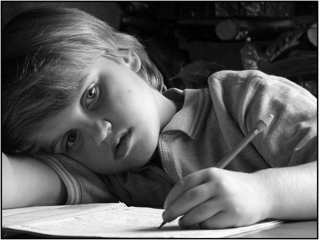
This is one of my favorites for this challenge. I just love the quality of the light and shadows, and the expression on his face is perfect! Only thing I'd change is to try to make the background darker so the object in the upper right-hand corner isn't visible. In any event, good luck with this one, hope it's a winner!
Forget the falling asleep shots. Here is where the imagination collides with the three R's. This is where schooling ends and thinking independently begins. Is this visual boredom or vigourous math calculations or even the creative genius about to invent atomic hydrogen fuel? I just love everything about this shot. No contest 10 times thanks.
Nice mood with good use of available light. The model is beautiful which gives the photo a universal appeal. This is important because some kids just aren't photogenic enough for anything but the family photo album. If this is your child, consider yourself blessed to have such a natural subject close at hand! Other good details are the classic yellow No.2 and eraser cap and the traditional shirt the boy is wearing. To many folks underestimate how distracting licensed t-shirts and trendy clothing can be in portraits of children which should have a timeless quality (IMO).
My only complaint is the bluish cast. I prefer a warmer black and white (not to be confused with sepia which I find overused). But kudos for a great, believable capture.
Hi there again! After realizing that I've left a few comments for b&w photos regarding the bluish cast (and noticing it on my own b&w entry) I took a look at the grayscale bar and realized the greys there have a definite bluish cast so it is obviously the monitor on my laptop! I did my entry on my other computer and it definitely did not look blue) Please disregard my comments regarding this. :-D
This was my favorite one in the challenge the first time I went through the thumbnails (around 10 min. after they were posted) and it's still my favorite on my fourth time through. Perhaps because I see this hundreds of times a week (I'm a teacher). My only suggestion -- and it is so minor I didn't even take it into consideration -- is to use a solid white or black background.
This has very nice composition. the expression is perfect. The background is a little distracting because you cant really tell what it is. I think the black and white could have been a little bit less gray. I think this shot will place well. 9 from me.





 Add photograph to your favorites
 Add photographer to your favorites

 Photographer found comment helpful.


