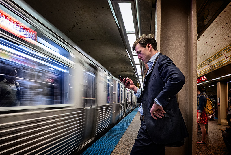
Tom mentioned cropping off the right side but I'm not so sure. I like your composition. The red colors on the right side are what attract the eye. Did you try b&w? Works well either way for me. Love that reflection on the left edge.
I'm enjoying this possible interpretation: he is so absorbed in his smartphone that he misses his train. I think the impact could be considerably enhanced by cropping out the area to the right of the pillar. voted earlier
The smirk, the pose, the motion blurred train all come together to make an impact. I'm wondering if black and white wouldn't have been a better choice for this.
this photo really could tell a million different stories. I like the motion of the subway in contrast to the main character's static pose. Pleasing color palette. Good luck in the challenge!









 Add photograph to your favorites
 Add photographer to your favorites

 Photographer found comment helpful.


