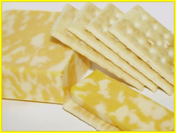
Cheese and crackers. Taken in my dining room. blank white paper as background. flash, and overhead lighting. color adjustments done in photoimpressions.
Statistics
Place: 45 out of 59 Avg (all users): 4.8900 Avg (commenters): 5.5500 Avg (participants): 4.7500 Avg (non-participants): 5.0417 Views since voting: 1691 Votes: 100 Comments: 21 Favorites: 0
Okay, I have to start with the most glaring error her and get it out of my way before I can move on. that awful border. With all the arguement about boarders being allowed/banned, here is a perfect example where the border detracted from the photo. I bet you would have scored at least 30 places higher if you hadn't added the border. What's wrong with it? A simple mistake - the color. The yellows in your photo all have a red (orange) cast and the yellow in the border has a green cast, Yuck - clash. When i see a color issue or a brightness issue, I like to look at the photo on several different monitors. On one, the yellow looked like yellow and on three it looked like neon with the greenish slant. Perhaps it looked OK to you. try desaturating all the green and blue. Too many people (me included) marked you down for the border color.
Hmmm ... I better say something nice quick so you'ss keep reading. This photo has a lot of potential but fell short. the idea is good, meets the challenge and all. I like the textures especially. Nice contrast of textures. I love the composition, but do you think it feels crowded? I'd have like to see a little leg room or head room on one of the sides. I think the top would be my choice for a sliver of more background. The compositional lines are lovely, you have a good eye, I've noticed that in your other shots too. Nice diagonals, crackers point to cheese right to left, cheese slice leads the viewer back left to right. makes a circular pattern for the viewer whis is very pleasing. The repeating lines are great too, the lines in the piles of crackers are viaually interesting.
So composition is your strong suit, it seems to come naturally to you. Some other stuff needs work. Is anything in focus here? I would have preferred a nice sharp focus to emphasize the play of textures that you have set up.
Given your natural artistic eye, I'm wondering if the other flaws here could be as simple as a monitor calibration problem. You say you adjusted your colors in post processing. But to me everything is too light and the colors are not bright enough, they look deliberately washed out. Did they look better on your computer? Cheese and crackers are pale enough without making the photo too light in addition. The natural color wou;ld have been effective. And that blankety blank border - how did that look to you? Is it a glaringly bright and mis matched?
Just for the sake of arguement I think you should go back to this photo and fix it. Give it a different border and boost those colors. (Don't change the whote balance, you got that on the money.). hey, then you could reenter it in the Before and After challenge.
Now the disclaimer - remember that this is only one opinion - mine - and I am very far from an expert here. I'm sorry that it was a harsh critique.
I really like this shot and the layout of the image. IMO it looks a little to bright or washed out though. Maybe there should have been just a little more contrast introduced? Thanks for Sharing!
Honestly, the border just overpowers the photo. Way to bright for me. But the photo is nice... and looks totally yummy. Cropping seems a little tight at the top near the crackers and the focus appears to be soft although it's hard to say because the cheese has such a unique texture. This could even be a neat study in textures... the cheese and crackers.
hiya heather... good idea for a composition... however it seems like the light is a little bright... a smaller apature setting would reduce that effect and at the same time help give you a deeper filed of focus so the back of the cheese is not blurry.. :o)
Interesting tones... not much depth, but that kind of works here. I think the bright yellow border undermines the subtelty of the colours in the photo. The lighting and composition are good.
Somehow the colours on that cheese don't seem right. Maybe a little more saturation would have brought out the orange in the cheese and made more contrast against the crackers. Good DOF. Nice sharpness.
Nice shot but a little overexposed and a little soft on the focus. Could have been sharper by using more of the 150 kb file size allowed. I would use a darker border as well.
Not real clear in focus. I would have liked the border much better if it was taken from the yellow tones in the cheese or crackers, rather than a neon yellow. Composition is the part I like best in this photo, and it met the challenge topic well.
Very nice composition, and light. The subjects are tooooooo much alike. There isn't enough contrast to make this interesting. I think that was part of the draw back of the DAIRY challenge. Milk/cheese....all the same color. Hum, I like this shot technically. Okay -good luck.
I really like the composition of this shot, and I think it is effective. I do think that a differently colored background would have helped give the picture a little more contrast, and grab the viewer more.





 Add photograph to your favorites
 Add photographer to your favorites

 Photographer found comment helpful.


