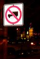
I think for this sign, the center placement in the frame works well. It freezes any motion or dynamics the picture may have. The blurriness of the trees should make the sign sharper, but it still seems a bit soft to me. I like the color contrasts as well.
As a side note, and not effecting your score, the border is a bit bright, I think. It almost clashes with the red of the sign, and detracts from the overall picture. I think a dark gray might have worked better. Or a darker gray with a tiny red line in it. But that is just my opinion.
nice sharp stop sign..the contrast of the background is good. I think if the sign were aff center it might have more impact. I don\'t think the border helps(wrong shade of red)
needs to be something more to this picture. Just the stop sign with the trees in the background is a little too plain for me. The stop sign looks a little out of focus on the left side as well. - Inspzil
Ouch! The red border really detracts from the image. The photo itself poorly focused and composed. Maybe if the sign were a little smaller and moved to one side or the other of the image. See the Rule of Thirds in DPC Learn/Tutorials. Better luck next challenge. 3 md
Very strong photo! Good color (I am assuming you remove most of the background color on purpose) The left side of the sign seems less sharp than the right side. (I think I would have done this as a square frame) 7 Swash
Well the message of this photo is obvious enough - as indicated by your title! The only thing I'm not that keen on is the border - it's quite harsh compared to the rest of the image which is soft. I think it would be a stronger image without the border, or perhaps a subtle dark border. Your framing of the sign is good.
It's cropped too closely for me to see much unique about this sign. It might be right at the edge of the woods and the road ends there, but I can't tell from the photo. Needs to be pulled back from showing some of the surroundings for me to see what is unique here. The sign is also fuzzy around the edges. Need better focus. It's a 4 from me.
I'm not a huge fan of borders, and in this case the border is definitely screaming for attention - so much so that it distracts. The focus seems a bit soft on the sign as well.






 Add photograph to your favorites
 Add photographer to your favorites


 Photographer found comment helpful.


