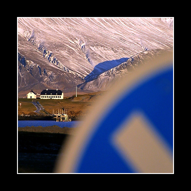
I am so unhappy about how low this finished! Only 3 other ppl agreed that this was an awesome shot? Maybe because the sign wasn't the subject. It is more of a distraction really, but the background is just so gorgeous that I can't blame you for focusing on it. I like the bold border too.
An interesting photo. I like it because it is different from the other submissions, but yet the out-of-focus sign in the forground is more a distraction than it is a contributing element. Maybe if it were just a little more in focus, and occupied a smaller percentage of the scene. Also, I think the huge black border is a bit of a distraction - a little too much border for this image. Still, I like it. 7 md
Scenery on hand like this gives you a huge advantage. I don't see anything achieved by throwing in a blurred sign. Looks like a spectacular landscape, with something blocking the bottom right corner.
Good concept and composition, however, the blur of the sign is distracting. It may have been done deliberately, but it somehow doesn't seem to enhance the overall effect for me.
I think this picture would have been positively awesome if you had used a different DOF, putting your aperture at highest it would go, would have allowed the sign to be in focus as well as the background. The colors here are great, as are you use of composition. The sign being out of focus is just really bothersome though. Nice creative use of the challenge. -8- good luck!
This is an interesting photo. The black and white border complement the black and white house well - which appears to be the focal point of the image. The blurred effect of the sign actually comes across quite well. Good job.





 Add photograph to your favorites
 Add photographer to your favorites


 Photographer found comment helpful.


