cool shot--the more i look, the more it grows on me! for some reason i could see this as an album cover for some cool alternative/indie band like pavement or sonic youth. ;)
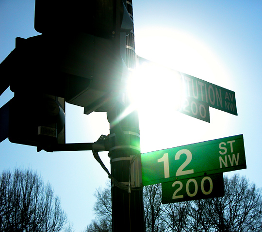
my first thought about the shot was that while i like sun flares very much--this one is overpowering--you can barely see the rays that make these flares so awesome--but it definitely works here.
i love the blue sky against the concentric circles of the sun, and the green of the signs--and also how the trees have taken on the blue hue--helps blend them in to the background with a cool effect.
compositionally, i might have liked to seen the post backed further to the left and not quite so centered in the frame--to enhance the sun and sign a little more--since they are the coolest part of the photo (to me!).
technically, looks good. you put your shutter/aperature speeds to good use in enhancing the sunflare, nice work.
all in all, very cool, cant believe it didnt score higher!
Gotta know? Wat this photo and title after the fact of getting home and finding it was the best shot, so it was titled as a coverup of an error or was this intentional. Cause I'm blinded by it also, yet I like it, for some reason. Just hope the drivers weren't as blinded by the "sun" light and could see the "stop"light. Nice one worth a 7 to me.
The overexposure of the sun is too much. It's overpowering the image even if it is the subject (which would sort of make this sign just in the way) - Inspzil





 Add photograph to your favorites
 Add photographer to your favorites

 Photographer found comment helpful.


