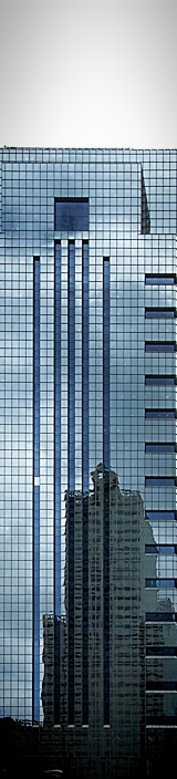
I gave you 6 for this, but as others commented, it was the sky that kept my vote down from what I might would have given it. Perhaps you could have shaved a bit from the sides and maintained the skinny aspect whilst making use of the allowable height, but even just cropped down to the top of the buildings it would probably have gotten 7-8 from me because I do love those reflections.
I would have cropped the sky off - I don't see that you gained anything by keeping it in. Either that or colored it blue so the building and sky blended together more.
I'm not sure the bit of gray sky is adding to the photo. As I write this comment, I'm scrolled down so that only the building is visible, and I definitely like it more that way. I think the shapes are interesting, and you used the long skinny shape of the image well. But I find myself wanting more contrast - blacker blacks and whiter whites.







 Add photograph to your favorites
 Add photographer to your favorites

 Photographer found comment helpful.


