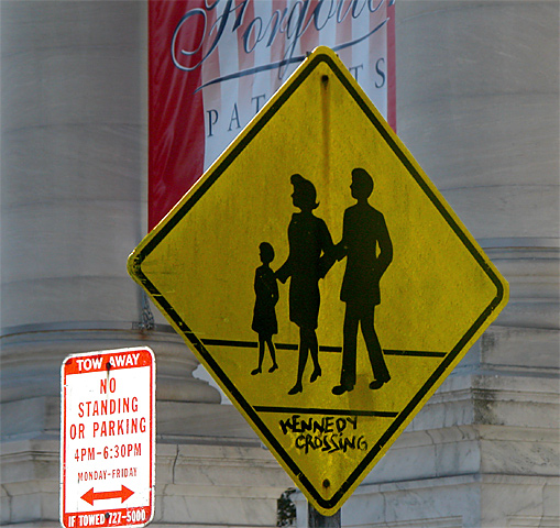
I particularly like the crosswalk sign in this image. It's off-center composition seems to work really well. I also consider that sign to be the 'subject' of this shot. That being the case, the 'no standing or parking' sign seems to be creating a minor problem for me. It is catching some light from somewhere that is making it much brighter than your 'subject' sign. I'm not sure if these two signs are supposed to be related in some way... I can't see it though.
Unfortunately, I believe that the banner behind the crossing sign is also somewhat distracting from the composition as well. I can't really offer any suggestions for improvement on this image. Not knowing the environment, I would not want to try to suggest different angles. There is probably a lot of clutter looking from other perspectives on this sign...





 Add photograph to your favorites
 Add photographer to your favorites


