Critique Club Review:
Color Saturation and Hue - Not applicable.
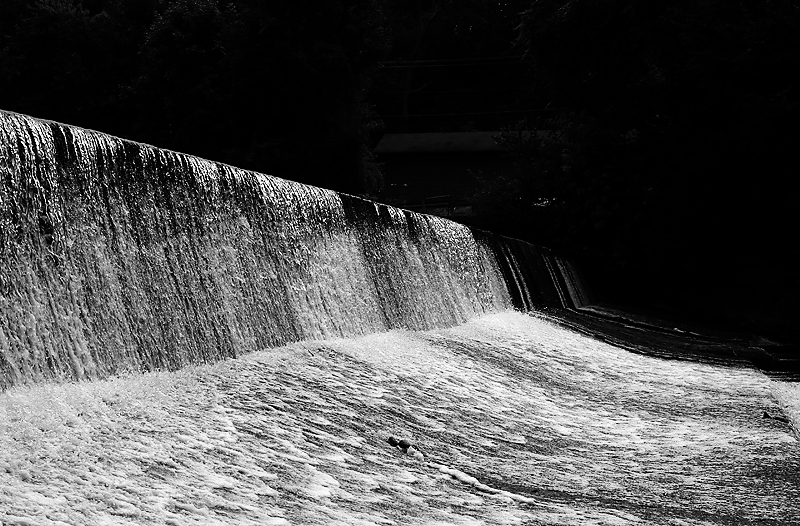
Brightness and contrast - I'm a pushover for inky velvet blacks... Sold!
Focus and depth of field - Tack sharp, and great depth of field.
Subjective - The bright specks above and beyond the waterfall distract my eye a bit.i really like the angle of the lighting. The flow of the water leads the eye out of the image, which could be a metaphorical vanishing. However the title makes me wonder why the flow of the image does not take me into the darkness.
Overall - another opportunity to seem clueless in front of a master. I'm in love with the backs and the contrasting water. |







 Add photograph to your favorites
 Add photographer to your favorites

 Photographer found comment helpful.


