Critique Club Review:
Color Saturation & Hue - Not Applicable.
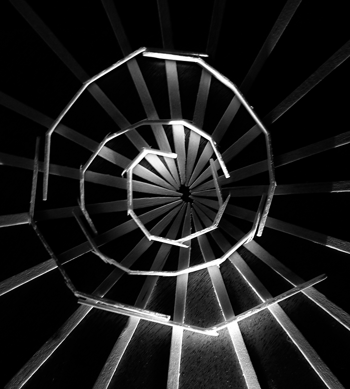
Brightness and contrast - the lighting seems a bit off to me. I'm a big fan of inky velvet black, but their power doesn't quite gather here. Perhaps more than one light might have helped. As is there are bright spots that fight with the piral for the eye's attention. I'm left wondering if the light following the spiral might have worked.
Focus and depth of field - excellent. The image is tack sharp.
Subjective - I like the image, but find the lighting vs the shape a bit jarring. A bit different lighting could have made this ominous, or another angle might have made it mysterious.
Overall, very daunting to try to critique an acknowledged master... |





 Add photograph to your favorites
 Add photographer to your favorites

 Photographer found comment helpful.


