Critique Club Review:
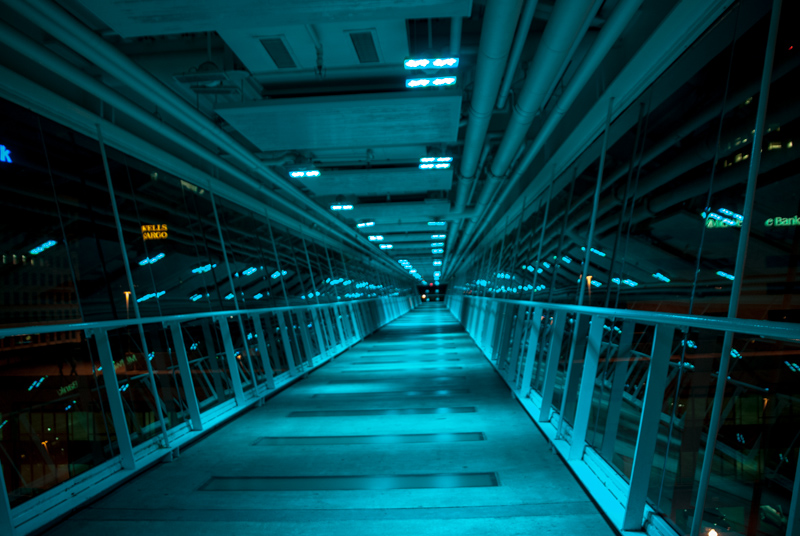
Color Saturation and Hue - colors are done with an overall blue hue. Looking at the details outside of the walkway, it appears the the lighting gives this effect, as opposed to manipulation by the photographer.
Brightness and Contrast - lighting is well done. A bit of burnout on some of the overhead lights, which distracts a tiny bit.
Focus and Depth of Field - Nice sharp focus, and a deep depth of field. Both work well in this image.
Subjective - as mentioned the Wells Fargo, and eBank signs distract. Since this is advanced editing, the distractions on the outside could have been darkened to the point they no longer commanded attention. The camera angle seem a bit tilted, or an least not square to the subject, so that the image seems to be off level.
Summary - I like the image a lot. Cloning out the bright dot, at the end of the bridge would have left the four blue lights more pronounced. They would look even more mysterious and ominous than they do now. |





 Add photograph to your favorites
 Add photographer to your favorites

 Photographer found comment helpful.


