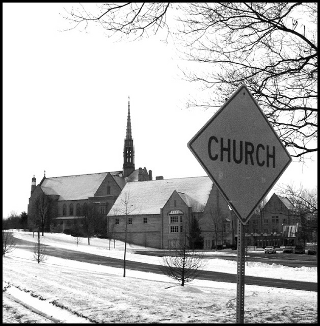
HEY! This looks SO much like a church we have downtown. I think it's a methodist though, and I do think we have those signs here in TN. I like the B&W. There is something a little off about the composition though and I actually think I'd prefer more DOF. The sign may be the subject, but my eye quickly moves to the building in the back. It bugs me that it is just slightly blurry. There is a lot of white b/c of the sky and snow. The placement of the sign makes all of the "non-white" seem a little bunched up in the middle. I'm not really sure what other perspective/angle you could have tried, but *gasp* using the rule of thirds (it is currently pretty centered vertically) could've found a better placement for the sign maybe. Putting it up there in all that white space on the left might be an option. You don't really need the building on the extreme right or the parking lot back there. Showing more space in front of the church might help it stand out more. I do like how the tree frames the top of the shot though.
I actually think that the church in the snow is just a lovely scene and is probably why this scored so well. Changing the composition slightly could've made this a real winner.
If you can, try to put in the aperture and shutter info. It helps those leaving critiques and other photographers.
Why Not? I mean, it's obvious that there's a church there, right? you've got a really nice b&w photo, nice and crisp, nice whites, greys, sure looks cold!
The DOF here is good. The composition of this pic is excellent. I'm seeing now that most of my snow pics will be set in greyscale. This is really well taken and composed. Great job - Inspzil
Nice idea but the composition is irratting. Could you have moved to the right about 5 feet and taken the pic? That would have put the Sign on the left, the Church in the middle, and that nice Tree on the right. Might have been better. As it is, the tree and sign are fighting for attention. 5.
A very clever shot. The B&W adds to the severity of the image. Compositionally I cannot fault it. The sky is a tiny bit too harsh, but still a great image. 9! -Annida
That's an odd street sign, most of the time the church puts up their own. I would've liked to have had the actually sign in the upper right hand corner instead of just under it, and I think this could have been done with a bit different angle and still kept the church a good part of it. How did this look in color?







 Add photograph to your favorites
 Add photographer to your favorites


