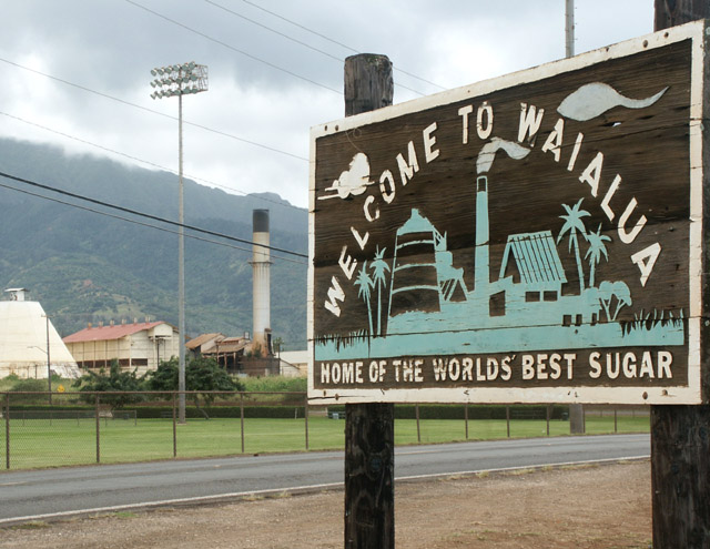
The Waialua Sugar Mill stands to the left of its historic sign. King sugar no longer reigns the island of Oahu (Hawaii). The weather is bad and the cables were unavoidable but the mirror image here caught my eye.
Statistics
Place: 116 out of 174 Avg (all users): 5.0564 Avg (commenters): 5.3333 Avg (participants): 4.9455 Avg (non-participants): 5.2000 Views since voting: 1246 Votes: 195 Comments: 11 Favorites: 0
Composition (content) First of all my apologies. I didn't see the relation between the sign and the background during the challenge, I just saw a sign with an ungly factory ruining the background. But now that I read your comment and have looked a bit better for this critique it was so obvious. :)
As soon as you see/know the relationship the telephone cables and stuff are just some background noise, shame that they are there, but not to big of a problem.
There are not too many ways to get the sign and its background relation into the same frame, so I think you did a good job on this. The sign's perspective points to the sugar mill and the horizon is in a nice position. The use of the small aperture creates enough depth of focus to get everytink in focus in the frame. The weather may be bad, but it has created an very balance lighting of the whole scene with natural colors, but without nasty shadows.
It is just that the sugar mill itself is ugly and seems like industrial waste in a mountain landscape.
Background See composition. The sharpness of the hill is very nice.
Camera Work (Technical) Good focus, sharpness & exposure. No comments.
Digital Processing (technical) Color balance looks good, sharpness as well.
The filesize has some room for saving the pic at a higher quality. It isn't very noticible here because a good algoritm is used, but a higher qualitye (close to 150kb in filesize) can save edge sharpness and the representation of contrastnoisy patches like the mud in the foreground.
My opinion Now that I know the relation: very cool.
But the subject isn't so beautiful. :)
Good eye, original!
I'm sure the cables killed me here, but they were unavoidable for the image I was trying to display. Thanks for the votes and the comments. Keep up the flame! Cub
the hawaii guy!! well the sign is nice, and you did a good job on it. my eyes keep getting drawn to the other side of the photo to all the distractions like telephone lines and such
Unfortunately the title contradicts the factory and powerlines in the background, which doesn't look "sweet" at all. It's a shame you couldn't get a better background for this sign (obviously sugar cane would be great). Your focus and exposure on the sign is quite good.
I like the angle you chose for the sign, but with the background, it lead my eyes right to some ugly and distracting poles and wires. It makes me wonder why you chose this angle and to include the plant and everything else on the background (Sugar plant?). I would like to have seen the whole pole on the left too, the way it is, it is cropped too close. The sign itself is in good focus, and I like the lighting, not too light or dark. 6.







 Add photograph to your favorites
 Add photographer to your favorites

 Photographer found comment helpful.


