Greetings from the Critique Club
Composition
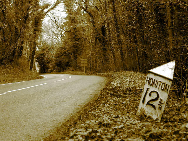
Good, I love the way the road curves away from the sign leading you into the scene making one want to see what is around the corner!
Exposure
I think that the sepia fits the sign giving an old time feel to the image. Black and white would have been too cold for this scene.
The focus is slightly soft. Maybe a higher aperture and faster shutter speed would have been sharper. Tonal Range is good.
Nice composition and colour. The image is perhaps a little too soft for my preference although I'm not sure whether sharpening it might help or hinder. The mile marker is well positioned in the frame and I love the way the road disappears - it makes me want to know where it goes.
maybe a more extreme pitch would have made the road fill the scene more, so that the 'horizon' was closer to the top of the picture and maybe you could have been closer to the sign ?
I like the photograph very much -- great placement of the marker -- but I'm not sure about the gold overtones. I think a more subtle sepia would have been better.
One of my photos I ended up not submitting sort of had the same composition as this. I like it! The use of sepia tones gives a nice feeling of the past too. 7
Sepia looks nice here. Everything seems to look good technically. I first look at the Honiton sign since it stands out and then my eye trails down the road. I like it. 9






 Add photograph to your favorites
 Add photographer to your favorites

 Photographer found comment helpful.


