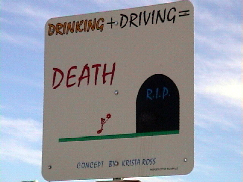
Overall: The sign is centered, with quite a bit of sky around it. It seems to me that it would benefit to be off center.. preferably to the right of the frame. The quality is suffering a bit, and, sorry to say, has no real "wow".
The sign is a tad underexposed. It looks like the sun was behind the sign - I had to revisit my sign in the morning to get around this. Framing is interesting and works ok - there's just a fraction of something creeping into the bottom left of the image, but that's not a big distraction. Your title is very good.





 Add photograph to your favorites
 Add photographer to your favorites


 Photographer found comment helpful.


