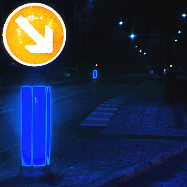
I know this will look way too much postprocessed for the majority of the people. And it is ;-) But I did it with a purpose. I wanted to express how signs are designed to actually yell their information into your face. They are made for being recognised quickly. The postprocessing carrys this idea on to a somewhat extreme point.
Unfortunately I didn't find an illuminated STOP sign. That would have fit much better.
I'm really curious if somebody sees what I wanted to convey. Currently I like the outcome of the photo very much. But maybe I'll have changed my opinion next week ;-)
Statistics
Place: 146 out of 174 Avg (all users): 4.6600 Avg (commenters): 4.5455 Avg (participants): 4.5000 Avg (non-participants): 4.8636 Views since voting: 1107 Votes: 200 Comments: 13 Favorites: 0
Composition/ Content I like the squared crop (despite what you say below) – I am a big fan (and user) of non-standard-ratio crops.
Interesting content though my point of focus is a little confused – I find myself looking more at the bright blue object beneath the sign than at the sign itself. I also find the road lights leading my eye away into the distance – this is actually interesting as the objects on the left then pull me back to the foreground.
Background Nice converging lines – I like that there is detail towards the front but less as we look further away – and the colours really convey night time road conditions.
Camera Work - Technical Seems very grainy but I like it – enhances the night-time feel.
Digital Processing - Technical Image quality seems fine – a little jagged around the white of the road sign.
I find it hard to say much as it's obviously a deliberate over-processing - I am not very knowledgeable about such processing.
Fits The Challenge Yup!
Your Opinion On The Photo Interesting and invites another look. Unusual colours and composition retain the attention.
Ok, my own opinion about this photo changed a little during the week. I still like the colours and the abstract look. However, the composition is really bad. Like scroosloose said, the lines lead your eyes to the background on the right side, but there is nothing!
This photo is a good prove that a bad original photo can't be improved by digital postprocessing ;-) Now I regret that I didn't take the time to go back to the location and tried another angle. I only made 3 shots of this subject and they all were done in a hurry. I also don't like the way how I cropped the photo.
Anyway, many thanks for your comments. I really also appreciate the negative feedback, because I currently have a strange liking for very abstract/colourful/contrast images and I'm unsure if that's really the path to follow ;-)
Regarding the questions about the glow: It was night and the sign was illuminated. Because I increased the contrast in postprocessing the glow, which was only very faint in the original, was amplified.
Liked this one. The lines seem to pull your eyes out the right edge of the picture though. Perhaps bring the right edge in just past the overhead lights?
Strange sort of abstract. I think I would've like this pic better without the neon blue things around the poles. It doesn't give the pic anything positive I think except brighter color. The grainy blue streetscape is actually pretty interesting itself - Inspzil
Very creative, and something I only saw while I was in Europe! I like this beacuse of its creativity. The colours are bleeding a bit though.. hmm.. I just love how different this is though! 9! -Annida





 Add photograph to your favorites
 Add photographer to your favorites

 Photographer found comment helpful.


