Challenge:October Free Study (Advanced Editing II) Camera:Nikon D70 Location: BCE Place, Toronto On. Date: Oct 19, 2004 Aperture: 4.5 ISO: 500 Shutter: 1/50 Date Uploaded: Oct 12, 2004
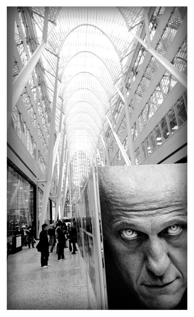
I took this on a field trip to the photojournalism expo that is touring the world. It showcases the best and most powerful images of the previous year. Because the majority of the photos are considered contoversial and political they have a very hard time finding places in North America to show. It mostly tours Europe and Asia, there are only 3 cities in Canada and 1 in the U.S. that held the expo this year. Although these are some of the most powerful images in the world almost none of them appeared in Newspapers.
Very few modifications, just cropped, desaturated, slight curves adjustment, darkened the edges and added border.
Statistics
Place: 235 out of 487 Avg (all users): 5.4615 Avg (commenters): 6.5263 Avg (participants): 5.4419 Avg (non-participants): 5.5938 Views since voting: 1652 Views during voting: 377 Votes: 247 Comments: 25 Favorites: 4 (view)
I've seen this place twice before, once entered into a challenge, I don't remember which one. I did comment on it then. However.....
Firstly, it works well in B&W, a little overblown in the ceilinng but.....
Its a litter tilted down to the left, I don't like that. I like the frame and the darkening of the inside border, it draws the interest towards the centre, where it should be.
OK, now for the artistic side of things...
A excellent viewpoint, the face in poster is very dramatic and dominating both in stature and in expression, gives a feeling of him being in control of the scene rather than the photographer. A big "Big Brother" ish.
Obviously a shopping mall, would have been better without the people, has a futuristic feel, given the architechture.
Emptyness while being whatched would have been better I feel.
Sorry for the Icelandic comment I left you on this one, I was absolutely sure this was a mall in Iceland. The comment transalates to "Very nice shot, both yours and the portrait in your shot".
Tyrkinn
What is really freaky about this photo is that in the thumbnail I swear the guy in the pictures eyes are closed, and when you open it up, they are open.
This is cool but I think you could of found a better angle. The lines implied by the building are too straight, wich is not bad for a symetry shot. but The guy in the poster ruins the symetry and the picture asks for some diagonal lines. Hope this makes sense.
So where is the world press photo exhibition right now? Love thhat shot of Colina - and taken for the most unlikely publication, being the Daily Mail in the UK, whihc is pretty much a sneering right-wing rag. I do like the efffect of photos in photographs, though I'm not totally sure about this one. He seems too dissociated from the rest of the image, not playing a part in the composition.
This is the third of such a picture I've seen of this facility. Where and what is it? I love the portrait in the corner but it needs to be in line with the horizin. Somewhat over exposed. BOL
Wow, this shot is worthy of praise. It was especially interesting because the image loaded from top to bottom slowly and the eyes just jumped out at me. Great idea and execution. 7.






 Add photograph to your favorites
 Add photographer to your favorites

 Photographer found comment helpful.


