| Author | Thread |
|
|
02/02/2003 03:08:47 AM |
Critique Club
Composition-Content
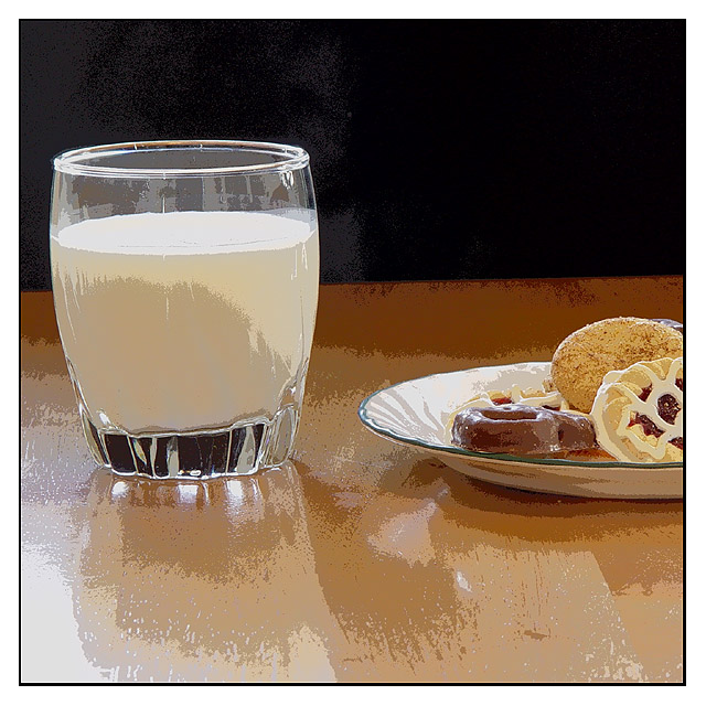
The composition is nice and simple, but if the picture was unprocessed, it probably wouldn't have a strong impact (IMO) What makes this picture is what you have done with it, unfortunately I haven't heard of solarize mode, but it seems to have an interesting effect. I am not sure how much of this effect was created in the camera and how much was through colour saturation and sharpening, but it is a technique which makes this picture stand out. I am not sure that this is the best type of shot to do this effect with, but it all comes down to@personal preferences, some people love it, some people hate it! Personally, I think that its great to play around with new techniques but I think that on this site, most people are not huge fans of it!
The black background sets the milk of nicely, there seems to be a bit of stray light which has been emaphasised in the processing stage, perhaps pointing the light away from the background would have helped. Also, the table is tilted, if this could be rotated a few degrees, it would help a lot.
Overall, I like the abstract nature of this shot, especially the different shades of colour on the table. Good Luck in the next challenge. |
|
 Photographer found comment helpful. Photographer found comment helpful. |
Comments Made During the Challenge  |
|
|
01/26/2003 10:31:35 PM |
|
Excellent composition and well framed. I kinda like the effect thats on the picture. |
|
| Photographer found comment helpful. |
|
|
01/26/2003 12:20:39 PM |
|
i wonder how many comments you are getting that this is a photography, and not a digital art website ... i like your shot a lot though. i especiallly like the pastries at the right and the different colors in the milk. the shadow and the background color make some interesting patterns. my only nitpick is that the background isn't quite straight, you might want to rotate CW a bit. good entry! :) |
|
| Photographer found comment helpful. |
|
|
01/25/2003 01:10:23 AM |
|
Great shot. I love it. Of course I like things that are different. Great colors!!! |
|
| Photographer found comment helpful. |
|
|
01/24/2003 05:37:50 PM |
|
nice shot...love the effects. horizon just a bit crooked. |
|
| Photographer found comment helpful. |
|
|
01/24/2003 01:43:01 PM |
|
Interesting color work. I'm sure that some won't like it but I feel it took an otherwise static photo to a new level. Good job. |
|
| Photographer found comment helpful. |
|
|
01/24/2003 12:31:03 PM |
|
Different. :-) I don't generally like this kind of post processing, but this is one of the more interesting shots this week. |
|
| Photographer found comment helpful. |
|
|
01/24/2003 12:58:06 AM |
|
the post processing makes it seem more like digital art instead of a photograph |
|
| Photographer found comment helpful. |
|
|
01/23/2003 10:40:42 PM |
|
yeah, whatever everyone else has told you already :) |
|
| Photographer found comment helpful. |
|
|
01/23/2003 02:49:46 PM |
|
I kinda like the over sharpening to appear as a painting. But there appears to be a slant to the photo. Could just be my imagination. Good composition otherwise. Nice job. Different. |
|
| Photographer found comment helpful. |
|
|
01/23/2003 12:39:36 AM |
|
Not sure if I like the mix of painterly parts of this image with the clarity of the cookies. |
|
| Photographer found comment helpful. |
|
|
01/22/2003 05:29:30 PM |
|
Nice simple shot. I like the composition. I'm not crazy about the (over saturation?) effect. Jacko. 7 |
|
| Photographer found comment helpful. |
|
|
01/22/2003 03:36:30 PM |
|
I'd love to know how you added that effect to the picture? I think it's awesome! i'M STILL LEARNING! |
|
| Photographer found comment helpful. |
|
|
01/22/2003 10:08:50 AM |
|
COOL! I love the crazy processing you did on this. Much better than a straight, setup photo of milk and cookies. It elevates it to the level of a cartoon, kind of bright and happy and childish. |
|
| Photographer found comment helpful. |
|
|
01/22/2003 12:56:00 AM |
|
I kinda like this effect. Is is just over-saturated? |
|
| Photographer found comment helpful. |
|
|
01/20/2003 08:48:54 PM |
|
Interesting use of contrast and sharpening here.Adds an interesting abstract feel. |
|
| Photographer found comment helpful. |
|
|
01/20/2003 08:00:48 PM |
|
I like your choice of finish on this one. |
|
| Photographer found comment helpful. |
|
|
01/20/2003 07:21:25 PM |
|
This shows visible banding effects on my monitor -- not sure if it's intentional or not. If it is it has the effect of making it look partly "real" (esp. the cookies) and partly like an illustration. I'd have rotated it slightly to the right. |
|
| Photographer found comment helpful. |
|
|
01/20/2003 04:51:02 PM |
|
I like the posterisation - it works wel, particularly on the biscuits. Just a shame the background isn't completely black. |
|
| Photographer found comment helpful. |
|
|
01/20/2003 03:47:28 PM |
|
This has posibilitys, it looks like you used an effect, maybe solorize or somthing.Maybe its just the pixelization due to image compression. Im not sure that this effect works with this image. It is very interesting and i like it but it seems to be missing somthing. |
|
| Photographer found comment helpful. |
|
|
01/20/2003 03:37:30 PM |
|
cup isn't level, the contrast doesn't work |
|
| Photographer found comment helpful. |
|
|
01/20/2003 12:54:14 PM |
|
Solarize! Got any DQ requests? This is totally legal, I recognize the effect. It does give this a surreal, impressionistic view of this very recognizable standard. I like it! The rims of the glass and plate tell me the focus is good, but this effect might fool some into thinking the focus isn't so good. 8 Swash |
|
| Photographer found comment helpful. |
|
|
01/20/2003 10:50:34 AM |
|
Posterize/equalize? Nice job and looks good. The perspective makes the glass look a little tilted to me. ? Good luck in the challenge. I like your idea. |
|
| Photographer found comment helpful. |
|
|
01/20/2003 09:48:45 AM |
|
Cool idea. I like this a lot. I'm one of those hardcore photo people though as far as challenge pics go. This is great digital art, but not a high quality photograph. It might be, but who can tell with all the overprocessing? - Inspzil |
|
| Photographer found comment helpful. |
|
|
01/20/2003 01:00:45 AM |
I think the original would have been better.
|
|
| Photographer found comment helpful. |
Theme:
Classic /
Light /
Dark
Home -
Challenges -
Community -
League -
Photos -
Cameras -
Lenses -
Learn -
Help -
Terms of Use -
Privacy -
Top ^
DPChallenge, and website content and design, Copyright © 2001-2026 Challenging Technologies, LLC.
All digital photo copyrights belong to the photographers and may not be used without permission.
Current Server Time: 10/17/2026 05:51:00 PM EDT.






 Add photograph to your favorites
 Add photographer to your favorites


