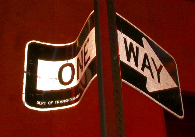
Composition - I like the composition of this photo to some degree. It isn't really weak nor really powerful either way. The post not being vertical bugs me a little. The background is dark and red and perfect for making the sign stand off the page. The foreground is pretty bright and very clear. I think the lighting works for the foreground. I think the few scratches on the sign where it was presumably hit give it a little character.
Photography - Well lit and exposed I think. DOF is not really an issue here and the photo is clear.
Post processing - I think this photo would be a candidate for radical transformations if it were mine. Maybe not for the challenge so much, but with a pretty basic one-subject relatively colorless shot, it might be time to have some fun. It looks like there may be a little jpeg artifacts floating around, but generally is pretty good and sharp.
Overall - This is a well taken photo. I'm not real wild about the composition though. The bend in the sign is enough to make it a little unique, but I think it needs something else. It is very close to being a really great picture. - Inspzil
This is how a drunk driver sees the signs all the time. This is too cute. Don't particularly like the red tone to it, but that's personal. As it goes as a photo otherwise it's technically a good one: cropping, subject, meeting challenge, focus, etc. Deserves every bit of an 8 techinically, just not personally. So you get the score.
Try www.neatimage.com to clear up the noise in this photo. There is a free demo available there. I do like this photo, its a good concepy, but i think the post should be vertical, not slanted. the left of the sign also looks a bit over exposed.
This is good. Like the colours and the composition. A little disturbing black part in the lower right corner but mostly you can´t do anything about that. Sending you high score from Sweden. Good luck
Well, that way of course! Nice find. Ppl where I live drive by braille, so anything along the road side is either damaged or knocked over, so this sign is in good shape for my neighborhood! Very well taken shot. Good focus, framing and lighting seems just about right. 8 Swash
Why is everything so red? It's kind of uncomfortable to look at. Other than that I like the framing and the whiteness of the sign does make it stand out as the centre of attention.






 Add photograph to your favorites
 Add photographer to your favorites


 Photographer found comment helpful.


