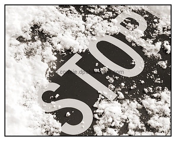
Nice idea makes it stand apart from the other STOP signs. Clairty and definition is good, I do wonder what it would have been like in colour though. The subtle border adds nicely to the shot too!
A really nice shot. I wonder why you didn't use color here though. I really like B & W but with the sign looking so new I thought the bright red might look really nice against the snow.
On second viewing, this needs a higher score. Very nice B/W with good story. Compositionally, I'd like the see the S just a little bit higher, but that's small potatoes. Very fine.
Very crisp and vivid - the snow has so much texture in it. Focus and composition are lovely - the only thing I would have done differently would be a little less snow around the top of the S (currently it blends a little too well). The border is very appropriate for the image. One of the better photo's this week.
I'm scratching my head on this one. I like it. I dont. I do. I dont... Not sure why, but as I write this, I lean towards liking it. I think maybe the STOP is a tad crowded in the frame. Maybe just a bit more breathing room may have helped. Or maybe not. I dunno. Oh, and too much border. 8 md
Obviously someone didn't! Nice and clear and sharp. Good cropping and the border adds to this. Still would love it in bright red against the white snow. That would be a show stopper, an eye catcher a 10. You could still keep your border. Still a good photo and technically sound, but only a 7.
I actually think red might have been cooler for this picture then black and white. I think this would have been an awesome pic, if you had made it color. It's really nice as it is, but it lacks pizzaz. Still a -9- though. Good luck.





 Add photograph to your favorites
 Add photographer to your favorites


