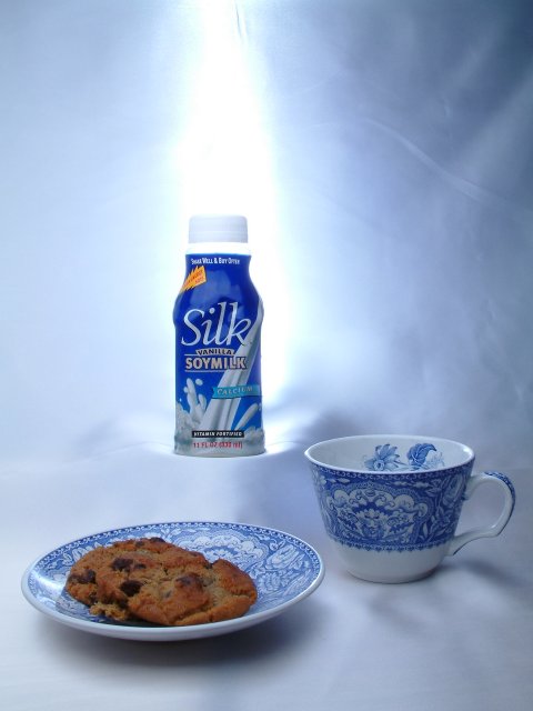
Ok this shot took a while to say the least. This is one of the first shots that I took. The light that appears to be shinning down on the Silk is actually Behind the background below the subjuct shinning up. For that I used an External Hot Shue Flash with a Peanut Slave attached. That was set off by my Alien Bee 400 Studio Lamp with a 2X3 foot softbox attached. When I moved the Flash behind the Background, I could not reproduce this shot. I tried many times and could not do this again.
Statistics
Place: 18 out of 59 Avg (all users): 5.7708 Avg (commenters): 7.0667 Avg (participants): 5.6471 Avg (non-participants): 5.9111 Views since voting: 1301 Votes: 96 Comments: 18 Favorites: 0
COMPOSITION
The composition of this shot is really nice. The milk bottle, cup and plate form a nice triangle which I think gives the shot stability. The light also helps to draw the eye up through the frame. I don't know that I would change any of the set up.
TECHNIQUE
Generally, the focus is good on this shot. The foreground elements seem a little soft, but that is not a major distraction since the focus is the bottle of milk. The color "scheme" is very nice. I think having the blue on the cup and saucer, and teh fact that it basically matches the bottle adds a touch of elegance to the shot. It has a blue cast on it, to me, and ordinarily, I think that would detract, but in this instance it adds to that "heavenly" feeling. I think it is a bit dark on the right and around the bottom. I understand that you were probably trying to get the light to be really significant, adn it is, but it is also blown out a bit. Maybe if there were some more diffused light to the right and bottom it would brighten it up a bit. A smooth background would have been nice, but I didn't notice it the first time around. :-) How would white poster board (or something similar) work, instead of cloth?
OVERALL EFFECT
The overall effect of this is one of peace and contentment to me. It has a very "cool" feeling, and is soothing and relaxing to look at. It met the challenge well, and in a creative fashion. Good work.
Yay! Soy milk! We don't have that brand in Australia, but when my boyfriend and I were in the US last year we drank it all the time, and it's heavenly!
I love the way you lit the soy milk to make it seem really important, almost angelic :). But the elements in this photo are a bit disconnected from one another compositionally. Some more overlap would make them compete less for attention.
Nice idea. I think a little more file size of the 150 kb allowed would have really helped here. A dark border may have set it off as well. Good take on the challenge.
a good way to advertise. I like this company's soymilk too. Hopefully we can convince more people that it really does taste goo. Awesome selection of dishes. Matches very well.
Great work with the lighting of this. The bright beam towards and behind the packet is very cool, yet the exposure of the other items in the frame is very good. Excellent lighting.
I like how all the blue works. The combination of background, foreground subjects and background main subject is very pleasing to the eye.
Nice composition.
This is almost advertisement quality. The only negative is the somewhat sloppy background at the right.
dramatic shot great colors. If I have to suggest something it would be crop in closer, maybe eliminate either the saucer or the cup for a less cluttered view.
have you ever tried vanilla soymilk mixed with orange juice? sounds gross but is actually really yummy. anyhow. your photo definitely meets the challenge. i like the beam on the soymilk bottle, definitely focuses your attention, even though the beam is just a little more overexposed than i would like. overall, i think you did well achieving that heavenly feeling, great color for the background, and good arrangements of objects in your shot. i wish the background did have a few less creases (noticeable on the right). overall, a good submission :)
AWESOME photo. Love the light. Sorry about the allergy. Beautiful combination of colors. Love the cup and saucer and the setting. Great job. Should be in there. It's get my 10.
Very nice pic. You will get a good score, but the thing that bothers me most about this pic is the backdrop cloth is wrinkled. I may have tried to backlight the cup a little, just enough so it doesn't seem shadowed. But this is a great idea and by no means poorly taken. - Inspzil





 Add photograph to your favorites
 Add photographer to your favorites

 Photographer found comment helpful.


