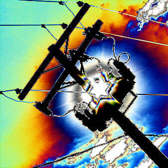
I don't like doing this, but I guess its personal opinion! I just didn't like the picture. I get the communication idea and I think it would have been a good picture if it was toned down a bit and you could have called it something like 'communication breakthrough', with what it seems like the sun breaking through the clouds…! ‘Don’t kill the …’ ;-)
Hopefully I was the only one with this bad opinion, nice picture for a album cover!
Definitely different, and meets the challenge on the most basic of levels. The hue shifting, however, is just not to my taste. Pretty dynamic piece of graphic art in my opinion, but not something I generally score high.
Sorry but not at all a fan of these edited shots with funky effects, that´s why I rated it very low. Just please keep in mind that this is only my opinion and if you like it that´s all that matters.







 Add photograph to your favorites
 Add photographer to your favorites


 Photographer found comment helpful.


