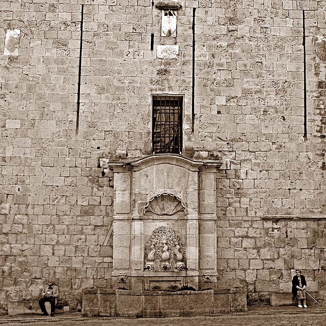
This one suffers from the size because the mans jacket and face blends into the wall, I would love to see this one full screen. I admire you for keeping all that height of the wall i. Grand composition, fantastic title, beautiful texture and tone. My favorite so far.
A difficult photograph to compose considering the physical givens of fixed lines, perspective and lens-dependent proximity to the several subjects and backgound. The difficulties are amplified by an evident slope of the terrain and the wall base. To trim the image orientation to the most pronouned and most numerous lines displayed in the face of the wall, is, no doubt, a reasonable compromise.
Graphically, the symmetry (of both architecture and distribution of human subjects) suffers from this. The capture, as a whole, however, coheres and, IMO, profits from these superficial 'faults'.
The decision to take the shot and present it, despite these difficulties (above) and the challenge to render the two people clearly against the shadowed complexity of textures which surround them) , is fortunate and appreciable.
The photograph speaks to me of age, of tarnished splendour and of youth, so absent from this picture, except, of course, for the fountain.
(I'd love to see a different photograph, taken, say, in North America, embracing the same vision and subject central to this one, to compare it to).
Hmmm... I like it a lot when a photograph makes me stop and look at it and think. However I don´t think this is "mindblowing" but it´s a very nice shot. 7
At first I'm thinking \"architecture\", then scrolling down I noticed madame \"I have a fishing cane and I'm not afraid to use it\", who leads me with her viewing direction to mister \"If I pretend to be asleep maybe she will get tired and forget\", until I glance back at madame \"If he really falls asleep I'm using my poking stick\", while mister \"I love it when she is so spirited\" returns madame's \"If I didn't love him so...\". As old as civilisation love is captured by your choice of filter, subject and background. Photo communicates a thousand words. Like stone blocks long relationships have solid lasting foundations. Upper space too huge but it is space that is being used as a tool to communicate. Individuals tiny. Great 8
Looks more like non-communication, but I like this photograph. Like sepia used, like the sharp focus. My favorite photograph in this challenge, so far.
oof...I'm afraid this very good picture won't do to well in this challenge. the title is too subtle, I fear. But maybe DPCers will prove me wrong! I wish the perspective weren't slightly askew on this, but a fantastic mood is captured here.
I had to study this for a moment to really take it all in. I think you should crop more, the crookedness of the top is just bad. But the lower half of the photo is primo! 7
I quite like the composition - the way you have used space, lines and scale. However, I find the processing too harsh. Looks like you have gone a bit too far with sharpening.







 Add photograph to your favorites
 Add photographer to your favorites

 Photographer found comment helpful.


