I get such a kick out of reading previous comments sometimes. This sign actually DOES something for ME ;P
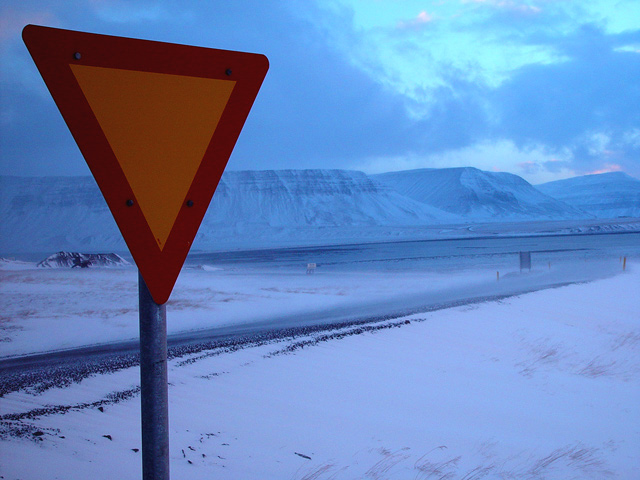
Besides making the shot meet the challenge (since you would otherwise be relegated to 1s and 2s from many voters), it adds a lot of contrast. You have the contrast of warm and cool, geometric and organic, man-made and natural, near and far, etc. IMO it wouldn't be nearly as good without the sign if only because it needs a strong focal point.
It does seem a bit dark to me, but I have an idea of what you're dealing with (my bf lived in northern Sweden and the sun had often set before I even woke up). This is SUCH a beautiful setting! The shot deserved its high score even with the lighting issue.
I also like the diagonals - how the sign isn't straight on and the lines of the landscape are slightly slanted. I think it's more of a perspective distortion than a flaw. The sign could be a tad more to the right as the photograph seems a bit too dissected as is.
Its a shame you didn't have a high quality background to put behind this very exciting sign with that intricate writing on it. More like why'd you screw up this perfectly good pic with that silly sign? Because it meets the challenge!! Awesome - Inspzil
Excellent! really nice colours and the background is beautiful. I think the horizon should be straight, but then the sign would look crooked, a hard choice. You've probably made the right one. 10
Awesome view and well composed. The road sign could be brighter though, to contrast in more against the pale, blue background. Would make the sign apear more a artificial body in nature. Still a great submission and good luck to you.
Gminish, is that you ? I always dreamt about Alaska ...
Anyway .. you or not you ;-) .. I just love that shot, the color contrasts, the way the lines are leading the eyes ... there .. somewhere in the nice and cold stillness .. probably going nowhere .. last sign (well almost) of urbanism ... going there to forget, searching for amnesia
PS:How could they manage to have a yield sign there ? there is that many cars ?
I think I would have preferred this shot if the horizon were horizontal (but that may well have meant that the sign wasn't vertical). Your shot has lovely colours and really catches the cold, empty mood of the landscape.
This looks like one really, really cold place! I'm not sure if I know what that sign means, but I like the concept of the photo. I also like the clutter free approach. Good job.
I like the way the triangular shapes repeat in this photo, as well as the little bit of color in the right upper portion kind of leads the eye from the sign as well as the grass, the road and the mountains do. Great shot!
What in the world are you going to yield to. This is beautiful. It's really a shame you are using it for "road signs" It's beautiful without the sign. I love the photo. Since it has to have the sign, I'll have to accept it. Still going to give it an 8 for the rest of the photo.
Wow you know this is a good picture but why did you title it "road sign"? You might as well have left the title blank. You should have used "Forgotten Road Sign". Or "A Sign Nobody Sees". Use some creativity!! 6.
The contrast in warm color with cool color is ncie here, and it's effective in its simplicity. I think I might have liked a bit more space on the left, but other than that, well done.






 Add photograph to your favorites
 Add photographer to your favorites


