Critique Club Comments by Grayce M. Dillon aka Gracious
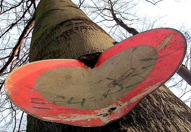
Nice composition. I like this perspective, especially the way it accents the heart shape of the sign.
Although it may be over-sharpened to some, I like how the bark is highlighted by the sharpness. The branches up top create an interesting pattern too.
The age of the sign is terrific. Like this sign has witness much in a lifetime.
Meets the challenge well, and nicely executed.
Thanks a lot to all of you for taking the time for a comment. Special thanks
to Arjen, who came back for a really nice comment after the challenge. As I
wrote already in my photo details, you can see here a german "no trespassing"
road sign. They are normally round. But this one seems to be a little bit older.
Over the years it was twisted by the growing tree. And from this angle it looks
like a "Artificial Heart".
Personally I am now in complete agreement with the comment of timwatts. The
adjustment of contrast by the post-processing is a little overdone.
This picture tells the story of a bruised and battered heart that happens to be a "no entry" sign. It's old and scratched but going strong; it is even resisting the force of the growing tree. I think unlike a lot of the other pictures in this challenge this picture has a story to tell, and as such (imho of course) it has been severely underrated! Congratulations!
I like this one. I'm not sure whether to laugh at it or cry though! The sky seems a little harsh and I'm not sure about the contrast on some of the branches. Excellent shot though and a really good composition.
Interesting how the tree seems to grown over the sign. Good eye to see this as a circle straight on, but from this (good) angle, it does appear in a heart shape.
8 Swash
You were realy lucky in finding one of the very few interesting signs of the challenge. Not only is it old, scratched and the tree is grown over it, its heard shape is wonderfull and you have a grat ese in seeing this. Most people would have passed by (including me).
However, somehow the cropping or size does not work well: on the thumbnail the "heart" is more obvious then on the enlarged picture. It's so big that the viewers eyes do not get the shape with one single view, his eyes have to move.
A square shaped cropping with a smaller sign might have been better.
Still, a very good picture with a wonderful idea. Good luck to you
I like the composition and framing of this shot. The tree seems to tower on forever. Unfortunately I don't find the sign very interesting, althugh I do understand the title well. Focus is very good. I actually find the brightly lit top-left of the sign a little distracting.






 Add photograph to your favorites
 Add photographer to your favorites

 Photographer found comment helpful.


