Critique Club Critique
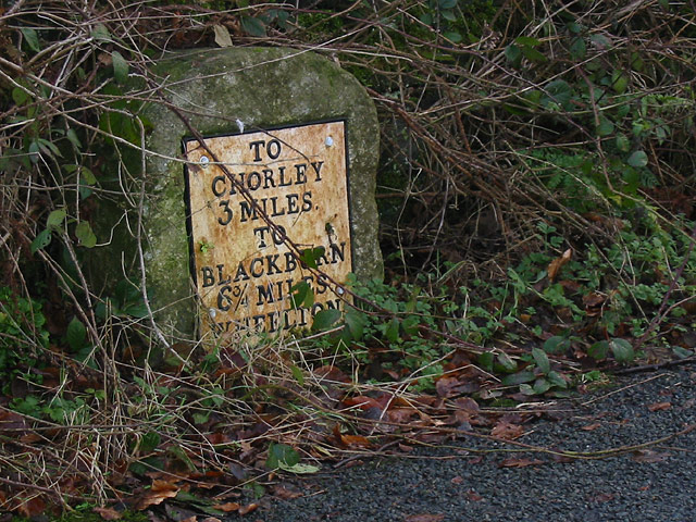
(1) COMPOSITION (CONTENT) – Very good composition. Placement of the sign and inclusion of the road is very good. A little more road would not hurt, in my opinion. My only complaint is the large branch that cuts the sign along the diagonal and the lower leaves. I would like to see them removed.
(2) BACKGROUND – Good. Nice color balance to the sign.
(3) CAMERA WORK ,TECHNICAL – Very good. Everything in focus.
(4) DIGITAL PROCESSING ,TECHNICAL – Looks quite good; no recommendations. Color works best here. In b&w you would lose the moss on the sign.
(5) MY OPINION ON THE PHOTO – I love subjects like this. A very nice photo of an historic road sign. However, I think you might go from very nice to excellent if the sign had the (distracting) branches and lower leaves cleaned away. The branches on the sides and on the ground in front as well as the “dirty white” would still give the age you want to show. To do this properly, you should probably do it in multiple steps, taking photographs along the way. Then choose the one that "looks right".
How slow one must drive to read this sign. It really should be cleaned up and the weeks cut back from around it. I'm serious. This is an antique and should be preserved, other than just in a really good photo, which you have done for an 8
Very neat road sign find. It is a bit hard to read, but that just adds to the feel of the age. The focus is excellent on the very very sharp on the sign :). I keep debating whether I like the road in the shot or not. It adds to our understanding that it is a road sign, which without some would probably question, but if it wasn't for this fact I would have left the road out. Overall though, I like the change from all the traditional road signs. 7.
Pretty good. I would probably have backed up, zoomed in and opened the lens up to get a narrow DOF to isolate the roadmarker from the confusion of its environment.
I love these old signs when you find them. Your composition is quite good. The only thing I would suggest is perhaps try a shot without the thick branch going across the sign and see which is more effective - I found it slightly distracting when reading the sign. Focus and colour is nice and appropriate to the image.





 Add photograph to your favorites
 Add photographer to your favorites


 Photographer found comment helpful.


