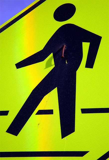
I was going to skip this challenge until I saw this particular sign. I thought the 'nail through the heart' with the shadow added some nice elements to this image. I tried to capture the 'rainbow' sun glare on this sign as well for some added impact, but that seems to look better on the thumbnail than on the full sized image :)
Statistics
Place: 69 out of 174 Avg (all users): 5.5942 Avg (commenters): 6.5455 Avg (participants): 5.7130 Avg (non-participants): 5.4457 Views since voting: 1616 Votes: 207 Comments: 23 Favorites: 0
COMPOSITION
Overall, I think the composition of this shot is good. The dude walking fills up the frame, and enough of the sky is included to give it some color contrast. For some reason, though, the little splotch of blue makes it have an "unbalanced" feeling to me. Maybe if there were another color or more blue in another part of the shot. Don't know if it would be better, just different maybe. When I first saw the shot, it struck me as being a little flat (most signs are, duh), but I am not sure what you could do to add context or depth without obliterating the nail. sorry.
TECHNIQUE
The colors here are awesome. the blue and yellow form a nice contrast, and the black stands out. The nail is visible, and casts an interesting shadow on the sign. I like the perspective of the shot. I see in your comments what the line running down the sign is, and it would have added impact, but on the full size picture, it looks like a mistake in lighting.
OVERALL EFFECT
This sign is extremely funny. You have to wonder if they nailed it like that on purpose or if they even realized what they were doing!! The brightness of the sign catches your attention, and the clarity of it keeps it. I like it.
nice live color here, and you really caught the shadow of the nail as well as the rusty nail itself. What's that yellow streak running down themiddle of the sign? some kind of stain, or shadow?
Great sense of humour. I like the bit of blue to compliment the overwhelming yellow. Nice tight shot. The nail shadow really adds value to your image. Good go.
Great shot! I got a good laugh from it. I was thinking the hail should be down a couple inches.....There's a odd orange line running diagonally throught the shot (hits his bent knee and forearm. It's odd, but I see no reason to change your score for it, just thought you should know. 8 Swash
One of my few favourits this time: I like it's almost graphical style, the angle of view and the small number of colors. The texture is great too.
The blue sky is very important and seeing more of it might have been even better.
Also the nail is a little dark and thus hard to see on the first look.
Still a wonderfull road-sign picture living from color, composition and of course the topic. Good luck to you.
Very unique take on the roadsign challenge. I like that it is different, and understand why the whole sign could not be included, I think that it is enough the figure was there. I don't reallyI like the rainbow effect going through the middle of the shot though it is a bit distracting. I can't believe the amount of detail you were able to pick up even down to the honeycombs (a bit tricky on the eyes though).7.
That's a very aggressive crop, but it works fairly well. The biggest distraction I have is the yellow line running slightly diagonally down the sign. I susect it might be glare of some sort, although the shadow on the nail indicates the sun is hard right. Focus is good, as is the title - well done.






 Add photograph to your favorites
 Add photographer to your favorites


