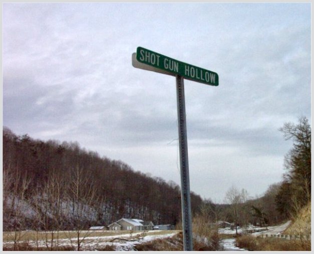
This shot looks a little washed out. Sorta like you are looking at a painting. Use of a sharpening utility would be welcomed to make the image more vivid. jgillard6
The sign on the reverse side somehow looks like the shadow of the first sign. Funny effect. The whole background kind of looks like a painting. I like it.
me thinks perhaps you should have stood up in the bed of a truck and shot downwards towards the houses for a more dramatic shot. Perhaps too much sky takes away from the shot
Here in my area, we would say that "shot gun holler." A neat sign, but it seems that the focus is a bit off, and I am seeing some noise in the sky. You might want to try NEATIMAGE (free download is available) if you have not. It does wonders on pictures.
A tad grainy, love the background images and composition, though. Makes it very much look like a "hollaw" Looks like something you'd see in my stomping grounds in the South, even with the snowy weather. You might want to have either made the sign really at an angle or straight up and down, too.
Funny title. Focus seems fairly good, but it seems overall on the grainy side (which effects how good the focus seems). It seems to need something more.....
6 Swash
The photo looks blurry, but it kind of adds a hand-painted feel to the drawing and I think it actually works fairly well. Composition of the image is good and the muted colours work well.
Pretty good... But what interests me is the "texture" of this picture? It looks like a Newspaper type of quality. Interesting, I like the look of it. Did you do it this way on purpose? If so, how?





 Add photograph to your favorites
 Add photographer to your favorites


 Photographer found comment helpful.


