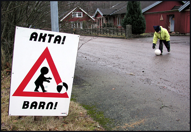
FIRST IMPRESSION: Cute sign, it made me smile! I also like the symmetry between the sign and the child chasing the ball.
CHALLENGE: Unquestionably meets the challenge.
COMPOSITION: Your composition is excellent. I love how the sign is the focus, and the child in the background adds to the composition, but does not dominate.
TECHNICAL: Exposure, color, post-prossing and technical settins are all good. The eye is drawn immediately to the sign before noticing the child in the background.
CONCLUSION: One of the better submissions this week, and certainly deserving of its top-20 finish. Congratulations on a great photograph!
Thanks for sharing and good luck in future challenges!
Nice, good setup! I like the placement of the sign and the kid in this shot. The focus is good on both subjects as well as the lighting, the background is a bit busy, but not too bad, mabey a bit less DOF would work here. The colors are pretty good for a wintery day. 7.
Well, it looks like you are proving the need for this sign. Composition is good - perhaps a tiny bit spread out (ie: distance between sign and child) but not too much. Exposure is quite good too, especially considering the weather.
Beautiful photo. Shame you didn't crop off the front part and get some sky. The red buildings would look wonderful against the sky. If you had taken it from in the street this could have been done without loosing the sign or kid. But you technically did a great job on the photo. It's still a 6.







 Add photograph to your favorites
 Add photographer to your favorites

 Photographer found comment helpful.


