COMPOSITION
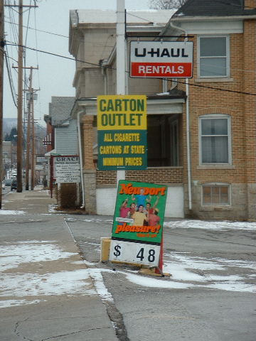
I believe the shot could be made stronger, as a whole, if you moved in and let the signs fill the frame a little more, maybe even "spilling" out. Also, maybe move the framing so that the signs are either on the left, and the poles are cropped out, OR the signs are on the right and the building is cropped out. This would move the signs out of the center of the frame, and keep it from seeming so "static." It would also keep the different elements from vying for the viewer's attention.
TECHNIQUE
The focus seems a little soft to me. I am assuming from the N/A on shutter speed etc, that you have little or no control of that. In that case, there might be a couple of things you can do to "hide" the slight blurriness. One would be to convert to black and white, then adjust the contrast so that the blacks are black, and the whites really pop out. I think doing that would help the eye to keep from trying to focus on the different colors as much as well. Another thing I would suggest would be to use a make shift tripod, if you do not have/do not want to carry one. Fill (about 2/3) a ziploc bag with sand, flour or sugar (the latter two do look suspicious from a distance), and use it as a "bean bag" to steady the camera. You can then use the top of your car, a tree limb, picnic table etc. and not have to worry about camera shake.
OVERALL EFFECT
I like the humor in this shot, and how the sign in the background looks like a church which is an interesting contrast with the other signs. Good luck in the future challenges.
Are those really roadsigns? Regardless, this is a pretty dreary grey pic. Looks like any small town in middle america, except that cigarettes are cheap there!! - Inspzil
This could have been such an interesting photo with a little more on the left. Gives the appearance of a place that hasn't changed much in the last 20 or 30 years. I'm having trouble buying this as "road signs", and not just in your photo, but guess I will have to accept it. Nice photo and well done. Just not enough of it. But still godd what you do have.
what's that elvis presley song "The Ghetto"? yeah this sort of seems like that song. the sings aren't in focus enough, but i think your composition makes up for that by showing a little bit more of the surroundings
Sharp shot with very good color. Title? they do seem to have cigarettes and rental trucks, I'll take your word for that they have other things, too. Background, well, not really great - busy. 6 Swash
I am not too sure if I would have gone with framing htre shots in center, especially with your title, it would have been nice to get the signs and also catch a glimpse of the store itself. I probably would have tried to use the rule of thirds and used the pole to create the left quadrant. That would have also reduced the distracting street/poles on the left currently. The focus is also a bit off on the signs also. This shot does have potential, I just personally would have liked it executed a bitdifferent.3.





 Add photograph to your favorites
 Add photographer to your favorites


 Photographer found comment helpful.


