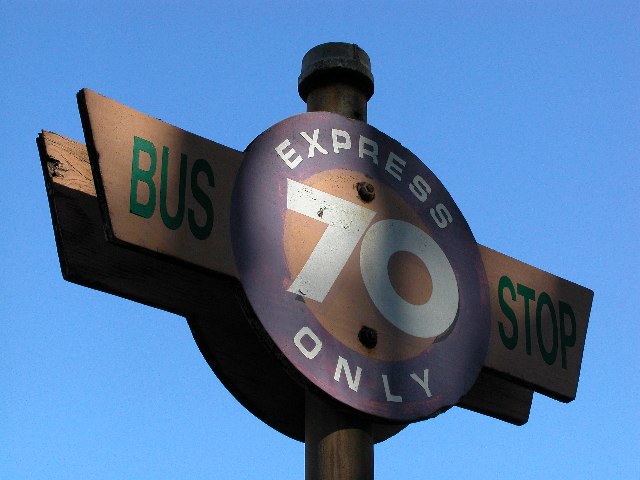
I think that you should use a better program for resizing your images. If you look closely at the letters you have zaggies. I hope that these are not jpeg artifacts. What I mean is that if the sign was a bit sharper, it would be more effective. I like the angle you shot it at though. jgillard6
Verh good shot! Extremely clean background! Focus is very good, but some of the edges seem a little pixelated (sorry, no suggestions) Good color. I'm a bit conflicted on the shadows on the front of the sign....seems to be more interesting, but somewhat obscuring, too (I'm not using that as score criteria, I'm just too wishy washy about it.) 7 Swash
those are some interesting shadows. it looks surreal it might be oversharpened a bit and it looks pixelated maybe because of a higher iso, but still it's a good picture
It's a real shame about the shadows. They're really mean in this photo. Should have waited on the bus longer and gotten the sun somewhere else. It took this from a 9 to a 6. Shadows only problem in my book.
Very interesting lighting. Normally I might have thought "poorly lit" but it adds an element of interest to the photo. The framing is nicely balanced. Some of the edges look just a little bit harsh - did you sharpen this photo? Otherwise it's very nice - and the blue sky background is wonderful.





 Add photograph to your favorites
 Add photographer to your favorites


 Photographer found comment helpful.


